Running multiple projects?
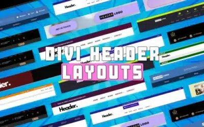
These 17 free Divi header layouts are designed for busy web creators in 2025 who need quick and stylish solutions.
With their responsive, customizable templates, you can easily build modern websites
Let’s get started!
17 Creative Divi Header Layouts Free from DiviGrid
Let’s explore 17 free Divi header layouts from DiviGrid designed to upgrade your website’s design and function.
| Divi Header Layouts | CSS | Quick Look | |
| 1 | Layout – 1 | Not Required | Demo |
| 2 | Layout – 2 | Not Required | Demo |
| 3 | Layout – 3 | Not Required | Demo |
| 4 | Layout – 4 | Not Required | Demo |
| 5 | Layout – 5 | Not Required | Demo |
| 6 | Layout – 6 | Not Required | Demo |
| 7 | Layout – 7 | Not Required | Demo |
| 8 | Layout – 8 | Not Required | Demo |
| 9 | Layout – 9 | Not Required | Demo |
| 10 | Layout – 10 | Not Required | Demo |
| 11 | Layout – 11 | Not Required | Demo |
| 12 | Layout – 12 | Not Required | Demo |
| 13 | Layout – 13 | Not Required | Demo |
| 14 | Layout – 14 | Required | Demo |
| 15 | Layout – 15 | Required | Demo |
| 16 | Layout – 16 | Required | Demo |
| 17 | Layout – 17 | Required | Demo |
#1 Layout (Black & Soft Pink)

A bold black background and soft pink highlight this header’s ( simple header 3) clean, modern design, making it ideal for businesses and creatives. The centered logo anchors the header, reinforcing brand identity right away.
The horizontal navigation bar makes key sections like Home, About Us, Blogs, and Contact easily accessible. Plus, the far right corner includes social media icons for quick access to platforms such as Facebook, Instagram, and Twitter. Check the Black and Soft Pink Header Layout Demo for a better view.
Features
- Looks great on desktop, tablet, and mobile devices.
- Soft pink contrasts with elegant black in a modern color palette.
- An easy-to-use menu for smooth navigation.
- Drive engagement by connecting social media accounts.
#2 Layout (Purple Gradient)

This simple header Layout offers a modern and eye-catching header design perfect for solopreneurs, startups, or creative brands that want a bold digital first impression.
Also, the horizontal menu, with a centered logo, guides users to essential pages like Home, About, Blogs, and Contact. A high-contrast CTA button on the right side encourages immediate clicks, perfect for signups, bookings, or inquiries. Check the Purple Gradient Demo.
Features
- Striking purple gradient background for a modern, stylish look.
- Central logo placement for strong brand visibility.
- Bold CTA button to drive actions like “Start Now” or “Join Us”.
- Built-in social icons for easy external engagement.
#3 Layout (Cyan & White)

This Layout header features a clean, modern design with a crisp cyan and white color scheme. The simple header 6 includes a left-aligned logo, a centrally positioned horizontal navigation menu with clear, bold links, and a prominent cyan-colored CTA button on the right.
Users will find it attractive and functional due to its clear visual hierarchy and easy navigation. This navigation menu is centered, offering a balanced visiting period. Check the Cyan & White Demo.
Features
- Crisp cyan and white combination for a vibrant, professional appearance.
- Users can navigate easily with a sticky header.
- Eye-catching cyan “Get Started” button encourages user action.
- Horizontal menu with well-spaced, easy-to-read links for intuitive browsing.
#4 Layout (Garnet Red & Black)

This layout presents a purple background complemented by black and white elements in a striking, contemporary design. The header features a left-aligned logo, a centrally positioned navigation menu with clear links, and a right-aligned garnet red CTA button.
The color palette creates a strong visual contrast (Feels like an image carousel), ensuring readability and brand impact. Three main elements: the logo, menu, and CTA button, are arranged horizontally for intuitive navigation. Check the Garnet Red & Black Demo.
Features
- Garnet red background for a distinctive, energetic feel.
- Black navigation links for high contrast and easy reading.
- A prominent CTA button on the right for immediate action.
- Ample spacing between elements for a clean look.
#5 Layout (Deep Blue)

This one features an eye-catching header with a deep blue background and white accents. For clarity and balance, all are aligned horizontally: the logo is left-aligned, the navigation menu is horizontally centered, and the CTA button is right-aligned.
Blue color creates a strong visual contrast, enhancing brand presence. On the right side, you will see some different social media icons. Check the Deep Blue Demo.
Features
- Deep blue background for a bold, trustworthy appearance.
- White navigation links for excellent legibility.
- Ample spacing between elements for a clutter-free look.
- Sticky header functionality for constant accessibility.
#6 Full Screen Layout (Cyan Mist)
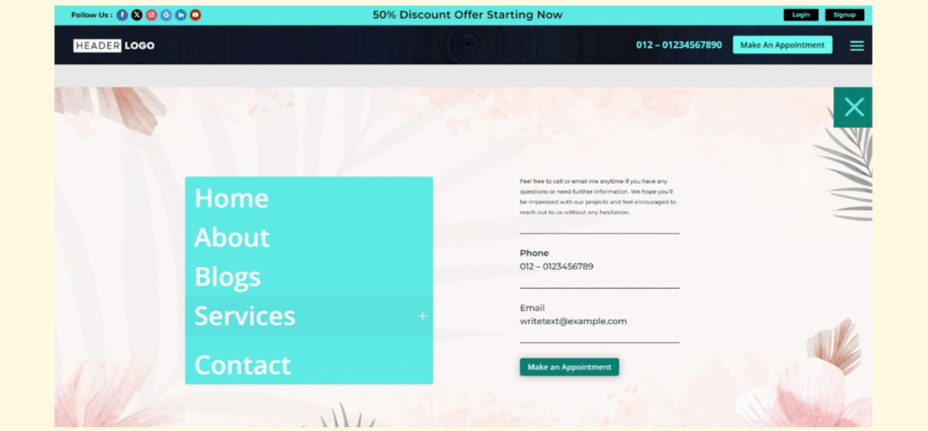
This modern website header has a vibrant, gradient background and a clean, user-friendly layout. At the top, a promotional bar highlights a “Discount Offer” with social media icons for easy access.
Moreover, the header section features a placeholder logo, a contact phone number, and a prominent “Make An Appointment” button, emphasizing user engagement. Check the Cyan Mist Demo.
Features
- Social media icons for quick connectivity.
- Prominent contact number display.
- Login and Signup buttons for user access.
- Modern, colorful gradient background with dynamic design.
#7 Full Screen Layout (Deep Purple & Yellowish)
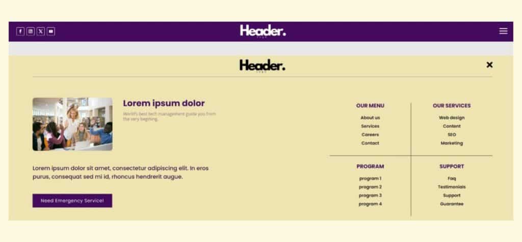
This Full-Screen header features a full-screen overlay with a centrally positioned logo, navigation menu, and a prominent CTA button. The background color is typically dark purple, contrasting with light-colored text for readability.
A balanced arrangement of elements ensures a clean and contemporary design. It contains multiple interactive elements, including navigation links, an all-to-action button, and a social media icon. Check the Deep Purple & Yellowish demo.
Features
- Full-screen overlay for immersive user experience.
- Centralized logo and navigation for easy access.
- Customizable CTA button to drive engagement.
- Professional layout for a modern feel.
#8 Full Screen Layout (Black & Golden Line)
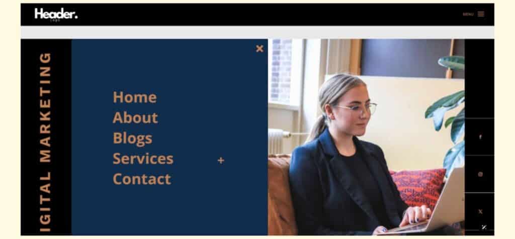
This full-screen header features a striking full-screen overlay design with a sophisticated black background accented by elegant golden lines.
Your site logo will be positioned in the header’s center, as well as a top horizontal navigation menu, and a hamburger menu icon on the right for expanded navigation. The color palette combines deep black with gold highlights, creating a luxurious and modern aesthetic. Check the Black & Golden Line demo.
Features
- Full-screen overlay header design.
- Centered logo for strong brand presence.
- Eye-catching central CTA button.
- Luxurious, modern color scheme (black & gold).
- Clean, minimalistic layout with clear visual hierarchy.
#9 Square Layout (Vivid Orange & White)

Square Layout is designed specifically for square logos and offers a dynamic, modern header that ensures smooth brand integration. The layout features a vibrant orange-and-white color scheme, creating a strong visual contrast and energy.
Key elements include a centrally positioned square logo, a horizontal navigation menu, and a vivid orange CTA button on the far right. Check the Vivid Orange & White demo.
Features
- Tailored for square logos, ensuring brand consistency.
- A vivid orange background for high energy and attention.
- White navigation links for clear readability.
- Easy customization for additional modules or styling adjustments.
#10 Slide In Layout (Forest Green & Peach Cream)
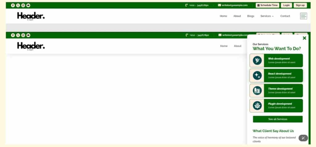
This layout, Slide In Header 3, presents a modern, interactive header that uses a forest green and peach cream color palette for a fresh, nature-inspired look. The header has a left-aligned logo, a horizontal navigation menu, and a right-positioned CTA button.
When triggered, the slide-in effect reveals navigation elements from the side, enhancing user engagement. The overall design is clean, visually appealing, and ideal for brands seeking a contemporary, eco-friendly aesthetic. Check the Forest Green & Peach Cream demo.
Features
- Slide-in animation for dynamic, interactive navigation.
- Left-aligned logo for strong brand presence.
- Right-aligned CTA button to drive user action.
- Horizontal menu for straightforward navigation.
#11 Advanced Layout (Golden & Dark Black)

In Advanced Layout, the header features a deep black background and rich golden accents. A left-aligned logo, a navigation menu centered in the header, and a right-aligned golden CTA button are all arranged in a single horizontal row.
The navigation bar includes several key sections, such as About, Hero, and CTA. It also includes additional links for 3D Model, UI Design, Illustration, Stay With Us, Advanced Header 3, and Back to Home, providing an intuitive and user-friendly navigation experience. Check the Golden & Dark Black demo.
Features
- Deep black background enhances contrast and readability.
- Horizontal alignment for a streamlined, modern appearance.
- Customizable navigation menu for easy site management.
- Bold, right-aligned CTA button to drive conversions.
#12 Advanced Layout (Dark Blue)

Advanced Header 8 Layout showcases a sleek, modern header with a deep blue background, creating a professional and visually appealing presence. The header features a left-aligned logo, a centrally positioned horizontal navigation menu, and a right-aligned CTA button.
The navigation bar includes the About, Hero, CTA, Need A Services button, and Make an Appointment. A prominent “Call Now!” CTA is positioned at the top, ensuring immediate user engagement. Check the Dark Blue demo.
Features
- Centralized navigation menu for an intuitive user experience.
- Responsive design adapts smoothly to all device sizes.
- Customizable CTA button to drive key user actions.
- Optimized for both desktop and mobile navigation.
#13 Advanced Layout (Lime Green)

This Layout delivers a vibrant, modern header with a lime green theme that energizes the site’s first impression. The header features a left-aligned logo, a horizontal navigation menu with links to Home, About, Services, Blogs, and Contact Us, and a right-aligned CTA button.
It also includes a horizontal icon-based feature bar below the main menu, displaying consulting, planning, branding, marketing, and business services with their icons. Check the Lime Green demo.
Features
- Vibrant lime green background for instant visual impact.
- Left-aligned logo for strong brand presence.
- Feature bar with icons highlighting five core services.
- Right-aligned CTA button for user engagement.
#14 Advanced Layout (Royal Blue)

Advanced Layout delivers a vibrant, modern header with a lime green theme that energizes the site’s first impression. The header has a left-aligned logo, a horizontal navigation menu with links to Home, About, Services, Blogs, and Contact Us, and a right-aligned CTA button.
Under the main menu, a horizontal icon-based feature bar showcases consulting, planning, branding, marketing, and business services. The menu has three main navigation elements and five service icons, blending functionality and style. Check the Royal Blue demo.
Features
- A five-service icon bar.
- Navigation links are clearly labeled and horizontally arranged.
- An attractive, right-aligned CTA button promotes user engagement.
- Content and branding can be easily customized.
#15 Advanced Layout (Burgundy to Midnight Blue Gradient)

With Advanced Header 13 Layout, you will notice a visually striking header with a smooth gradient background transitioning from rich burgundy to deep midnight blue.
There is a left-aligned section in the header highlighting a contact button, a central navigation menu with Offer, Blog, Discount, and About sections. The header structure is horizontal, balancing branding, navigation, and user actions in a single and cohesive row. Check the Burgundy to Midnight Blue Gradient demo.
Features
- Eye-catching gradient background from burgundy to midnight blue.
- Left-aligned experience badge for instant credibility.
- Right-aligned Login and SignUp buttons for user account access.
- Integrated contact number for immediate communication.
#16 WooCommerce Special Layout (Black & Golden)

Designed for e-commerce, WooCommerce Special Woo Header 05 Layout uses a striking black background with golden accents for a luxurious shopping experience. The layout is horizontally structured, balancing branding, navigation, and user action elements in a single row.
There are left-aligned shopping slogans (“Happy Shopping, Happy Life”), a navigation menu with links to My Account, Wishlist, FAQ, and Contact Us, and right-aligned operational details, including opening hours and a CTA. Check the Black & Golden demo.
Features
- Left-aligned shopping slogan to set a welcoming tone.
- Centralized navigation menu for streamlined browsing.
- Dedicated links for My Account, Wishlist, FAQ, and Contact Us.
- Right-aligned business hours for customer convenience.
#17 WooCommerce Special Layout (Steel Blue)

With WooCommerce Special Woo Header 01 Layout, you get a clean, modern header with a steel blue background, designed for e-commerce. To the right, a horizontal navigation menu offers direct links to Home, About, Services, Blogs, and Contact Us.
The header includes a prominent product search bar on the left and icon-based links for Wishlist, Cart, and Account, making navigation intuitive for shoppers. The search bar, Wishlist, Cart, Account icons, and navigation menu are the five main elements of the layout. Check the Steel Blue demo.
Features
- Steel blue background for a calm, trustworthy look.
- Left-aligned product search bar for quick product discovery.
- Icon-based Wishlist, Cart, and Account links are available for easy access.
- Horizontal navigation menu with essential site links.
Benefits of Adding These Headers to Your Divi Website
Adding these professionally designed headers to your Divi site can instantly enhance the look and feel of your website.
It’s Simple to Add
These headers are incredibly easy to integrate into your Divi layouts. With just a few clicks, you can import the header and start using it immediately.
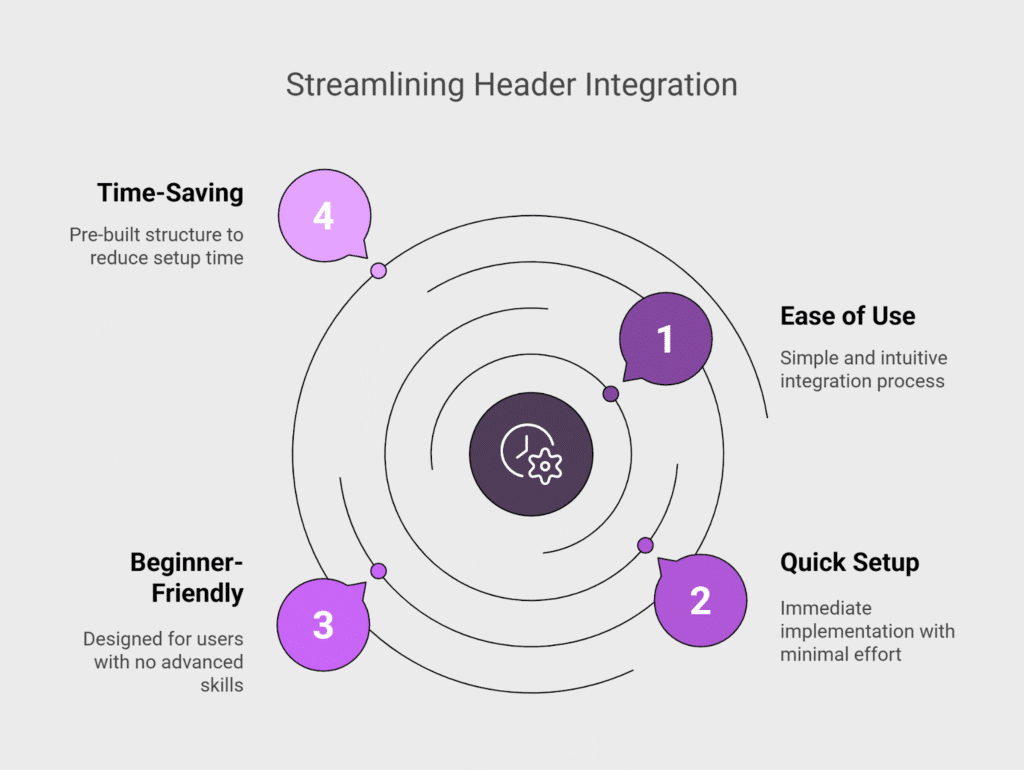
There’s no need for advanced skills or technical setup. It’s designed for users of all levels, especially beginners. Everything is pre-built and structured to save you time.
All Layouts are Responsive
Each header layout is fully responsive and adapts to all screen sizes. It will look beautiful no matter what device your visitors use, whether a phone, tablet, or desktop computer.
Mobile-friendly design also supports SEO and higher engagement. You don’t have to worry about resizing issues or broken layouts. Everything adjusts automatically to fit the screen.
1-Click Customizability
Customizing your headers is quick and effortless with Divi’s visual builder. You can update colors, fonts, icons, and buttons with a single click. This gives you complete creative control without the need to touch any code.
It’s ideal for branding your site to match your unique style. All edits are live, so you can see the changes as you make them.
Compatible with WordPress 6.8 and Divi
These header layouts are built to work perfectly with the latest WordPress 6.8 and Divi versions. You don’t need to worry about plugin conflicts or outdated elements.
The codebase is updated and maintained to match current standards. It ensures long-term compatibility as both platforms evolve, meaning fewer bugs and smoother integration into your existing site.
Doesn’t Impact Site Performance
Designed with performance in mind, these headers load quickly and efficiently. They’re lightweight and don’t add unnecessary bulk to your website, which means your site stays fast, which helps with SEO and user experience.
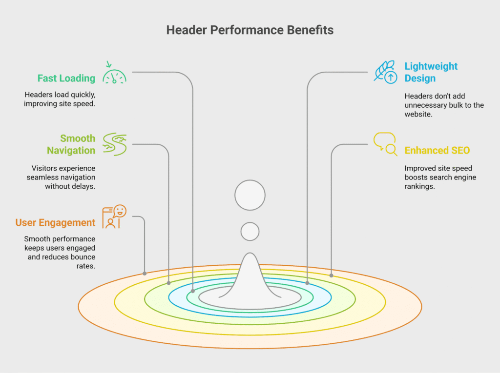
Visitors won’t experience delays or lag when navigating. Smooth performance helps keep users engaged and reduces bounce rates.
No Additional Coding
No coding is required to use or customize these headers. You can build and adjust everything visually using Divi’s drag-and-drop interface. This makes the process beginner-friendly and saves on developer costs.
Even advanced changes can be made without leaving the builder. It’s a stress-free way to manage your site design. You stay in control without dealing with complex code.
Tested for Performance
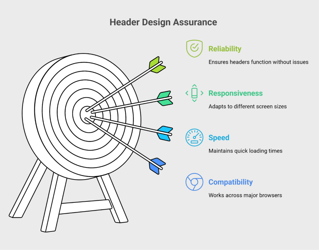
Every header is thoroughly tested before release to ensure top-tier performance. It’s also checked for responsiveness, speed, and compatibility with major browsers.
This means you get a reliable design that won’t break or glitch. All layouts undergo real-world testing, not just theoretical builds. Performance metrics are a key part of the design process. You can trust that these headers are ready for professional use.
FAQ
Does DiviGrid offer a “Pay What You Wish” offer?
Yes, DiviGrid offers a “Pay What You Wish” option on selected layouts. This allows users to choose the amount they want to pay, including $0, making premium designs accessible to everyone.
Are the header layouts mobile responsive?
Yes, all DiviGrid header layouts are fully responsive to mobile devices. They automatically adjust to fit smartphones, tablets, and desktops, ensuring a consistent browsing experience across all devices.
Do we need to install these Divi header layouts?
No separate installation is required. You import the layout directly into your Divi Builder using the JSON file provided. Once imported, you can easily start editing and using it like any other Divi section or module.
Upgrade Your Site Professionally with These Free Divi Header Layouts
These free Divi header layouts are perfect if you want to enhance your website’s appearance and functionality without spending extra money. They can be installed quickly, and they are fully responsive, so your site will look great on any device.
There’s no need to write a single line of code, and 1-click customization makes matching your brand’s style a snap.
Plus, they’re tested for performance and work smoothly with the latest versions of Divi and WordPress.
You’ll save time, boost your site’s appeal, and create a better user experience. Upgrade your Divi site today with these free, high-quality header layouts.




0 Comments