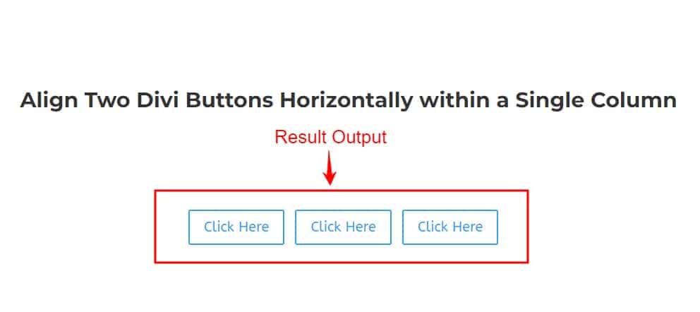
Add Two or Multiple Button Modules
Add Some Custom CSS Code
When you want to tweak your website’s buttons, it’s important to do it the right way to ensure they look and work just as you want them to. Instead of directly changing the buttons themselves, we’ll focus on the column that holds them. This is where we can target the button wrapper, which is key for making sure your buttons behave and look great.
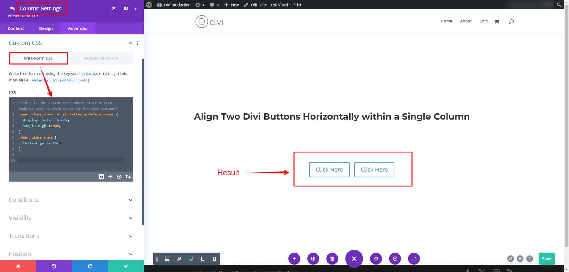
To get started, find the row and column where you want your buttons. Then, go into the column settings and look for the “Advanced” tab. In there, you’ll see a field called “CSS Class.” Add a simple class name like “your-class-name” and save your changes.
Now that we’ve assigned the class to the column, we can make the changes we want to the button wrapper. This approach ensures that our modifications are specific and won’t affect other parts of your website.
To wrap things up, you’ll need to add a small piece of code to your website. This code will apply the changes you’ve made to the buttons in the designated column. Following these steps will not only make your buttons look great but also help your website perform better in search engine results.
Adjust the spacing between buttons to avoid them appearing too cramped. It’s recommended to access the button settings and add a margin of approximately 15px to the right button for optimal alignment.
/*This is the custom code where place button modules are next to each other in the same column*/
.your-class-name .et_pb_button_module_wrapper {
   display: inline-block;
   margin-right:15px;
}
.your-class-name {

text-align: center/left/right;

}
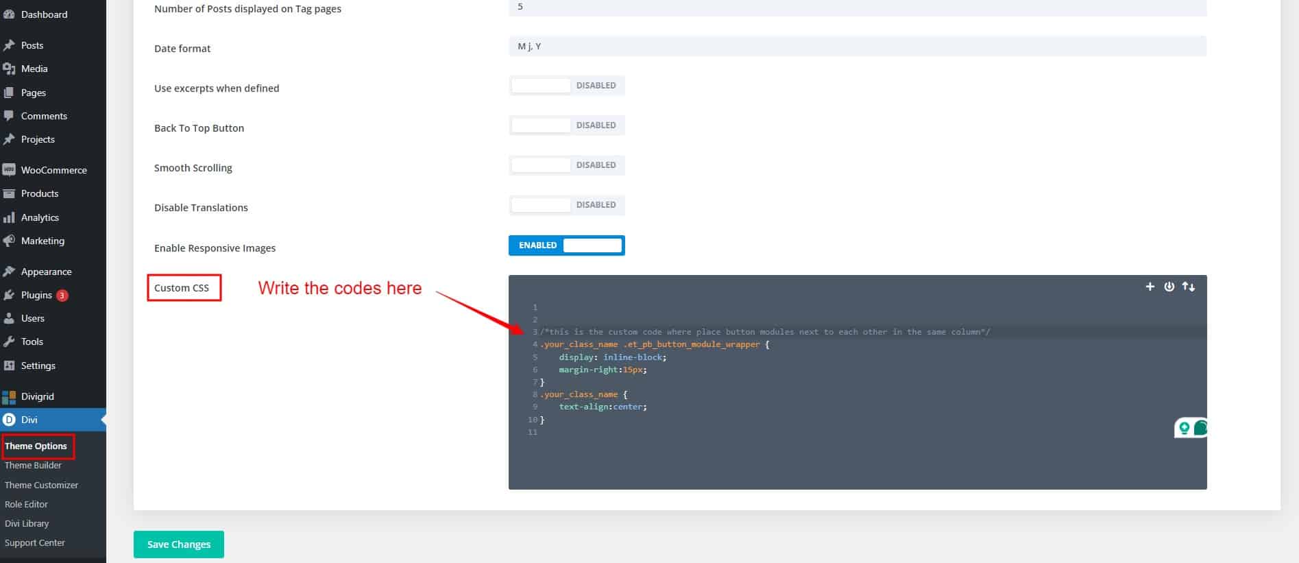
Where write this snippet codes
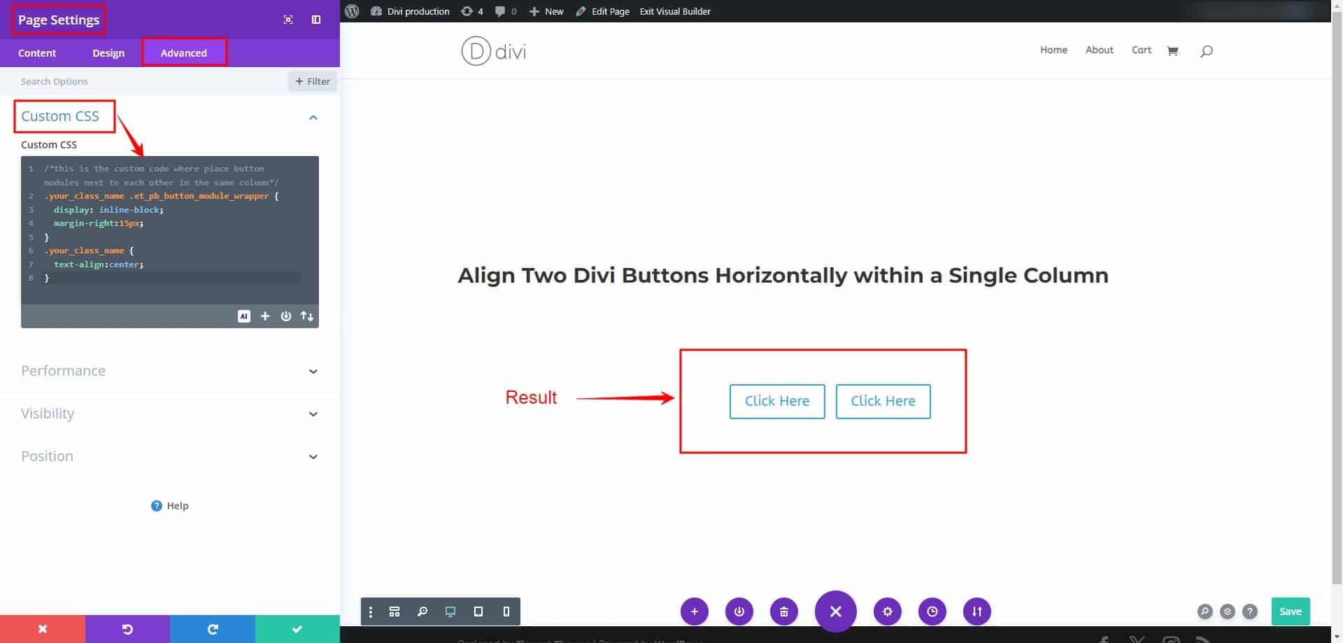
You can write the custom code in three ways:
- Utilize the custom CSS field in the Divi theme’s options.
- Use custom CSS fields in page settings.
- Write the class in the column’s custom CSS field, where you’ve added it from the advanced tab. All the accompanying pictures are provided below.
In Divi Theme options
Page Settings
Column Settings
Looking to avoid writing custom CSS?
Look no further! Dive into our DiviGrid Multiple Buttons module, where you’ll find a responsive, sleek Button Module featuring over 20 unique modern hover effects.
Check out our captivating multiple-button demo through the link below. Experience effortless button customization without the hassle of CSS coding. Elevate your website with our eye-catching, user-friendly button options today!
Here is the button link:
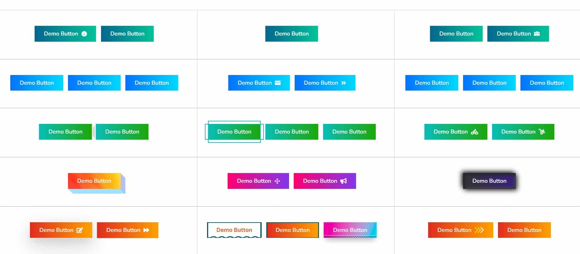
Check out these demo designs for multiple button modules! If you’re eager to explore more, feel free to take a tour through our collection of multiple button module demos.
Divigrid Multiple Button Module
Final Thoughts
In this comprehensive Divi tutorial, we’ve provided step-by-step guidance on implementing the necessary CSS code to achieve this desired layout efficiently. By carefully following these instructions, you’ll bid farewell to the hassle of managing buttons in separate columns and embrace a more streamlined approach to button alignment within Divi.
By adding two or more button modules within the same column and applying the custom CSS code to the designated column, you’ll create a visually appealing and organized layout for your website’s visitors to interact with seamlessly.
Furthermore, we’ve included additional tips on adjusting the spacing between buttons and positioning them within the column—whether left, center, or right—to ensure optimal alignment and aesthetics.
For those looking to avoid writing custom CSS, we offer an alternative solution: the DiviGrid Multiple Buttons module. With this module, you can access a responsive and sleek Button Module featuring over 20 unique modern hover effects. Explore our captivating multiple-button demo to experience effortless button customization without the need for CSS coding, and elevate your website with eye-catching, user-friendly button options today.
With these resources at your disposal, you can effortlessly enhance the functionality and visual appeal of your Divi website, providing users with a seamless and engaging browsing experience. Say goodbye to button alignment woes and welcome a more efficient and aesthetically pleasing solution to your Divi design endeavors.




0 Comments