For Divi users, a popular WordPress theme known for its versatility and user-friendly interface, implementing the Divi background image blur effect might seem like a daunting task, especially when aiming to apply it exclusively to certain elements such as the blur background image of a section or row. In this guide, we’ll delve into the technique for exclusively applying the Divi background image blur effect to a section or row. Whether you’re a seasoned web designer looking to enhance your Divi projects or a newcomer eager to explore the possibilities of blur background effects, this guide will provide you with the knowledge and tools needed to create visually stunning websites that leave a lasting impression. If you are seeking an online tool which creates a nice blur background of photo or blur effect, here is a tool you can easily use to blur background online.
Background blur effect
1. Divi Background Image Blur Effect
In the world of web design, achieving the perfect visual harmony on a website is paramount. Divi, a highly customizable WordPress theme, offers myriad options to enhance the aesthetics of your site. One such feature is the background image blur effect. However, applying these effects in Divi presents a challenge: they tend to affect the entire section, including its modules, rather than just the background image. This can detract from the overall design coherence. To circumvent this, we need a strategic approach that allows us to blur the background image while leaving other elements untouched. This guide will walk you through the steps to achieve a targeted blur effect, enhancing the visual appeal of your Divi layouts.
This is before the effects

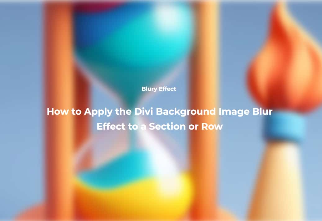
Final output

So the problem is The Filter Effects Affect Everything – Not Just the Background.
1. How can we overcome it?
The key to solving this challenge lies in leveraging custom CSS classes and the parallax effect settings within Divi. Initially, it might seem daunting due to the lack of direct options for targeting only the background image. However, a breakthrough can be found by utilizing a class activated by the parallax effect. By crafting specific CSS for this class, we can apply the blur effect solely to the background image. This method is both effective and essential for maintaining design integrity, allowing for precise control over visual elements.
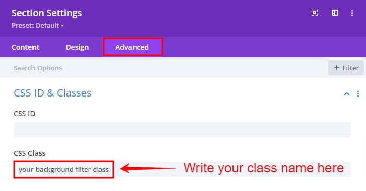
First step: Add the class to the section or Row where the background is to be filtered
Begin by adding a custom CSS class to the section or row where you want to apply the blur effect. This class will serve as the identifier for our custom CSS code. To do this, open the settings for the desired section or row, navigate to the Advanced tab, and find the CSS ID & Classes toggle. Enter “your-background-filter-class” into the CSS Class input field.
Section or row settings → Advanced tab → CSS ID & Classes toggle → your-background-filter-class
This step is foundational as it allows us to target the specific section or row with our custom CSS.

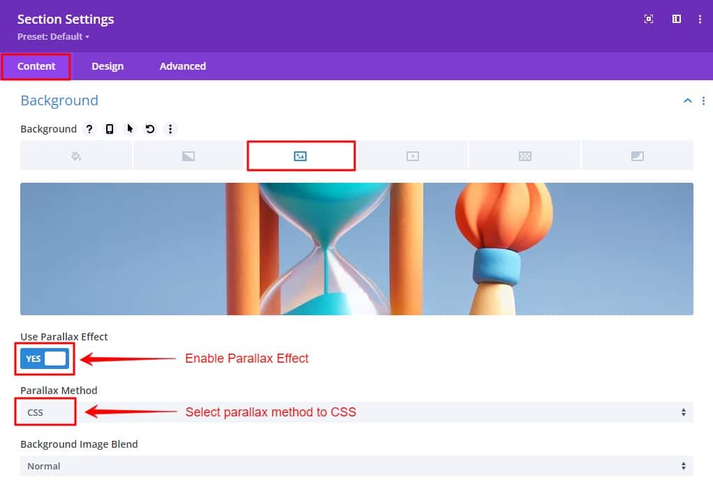
Second step: Enable the Parallax Effect
Next, head to the settings for the same section or row. Under the Background options, specifically the background image tab, activate the “Use Parallax Effect” setting. Ensure that the “CSS” option is selected as the “Parallax Method.”
Section or row settings → Background → Background Image → Use parallax Effect → Switch On
Section or row settings → Background → Background Image → Parallax Method → Select “CSS”
This step is crucial as it enables the class we need to target for our custom CSS.

Third step: Disable the Parallax Effect
We need the parallax effect enabled to obtain the “et_pb_parallax_css” class, but we will disable it via code. This ensures we can target the background image specifically. Insert the following CSS code to disable the parallax effect:
/* Disable parallax effect */
.your-background-filter-class .et_pb_parallax_css {
background-attachment: inherit! important;
background-position: 50%;
}
The “.your-background-filter-class” class selector is essential for pinpointing the section or row containing the background targeted for adjustment. Meanwhile, “.et_pb_parallax_css” serves as Divi’s designated class for elements featuring a CSS parallax background effect. Through the CSS code provided, “background-attachment: inherit ! important;” plays a pivotal role by resetting the background-attachment property to inherit, effectively overriding any predefined parallax background-attachment settings. The inclusion of “!important” ensures this instruction takes precedence over Divi’s default parallax setting, offering greater control and specificity.
If you want to enable the parallax effect and background blur like in the image above, you can eliminate this CSS code. Additionally, “background-position: 50%;” ensures the background remains centered, aligning with its appearance when parallax is inactive, thereby maintaining visual consistency and coherence within the design.
Fourth step: Add Custom CSS for blur effects
Custom CSS box within Divi > Theme Options
Or
.your-background-filter-class .et_pb_parallax_css {
filter: blur(10px);
-webkit-filter: blur(10px);
}
Final Thought
By using a combination of custom CSS classes, parallax effect settings, and tailored CSS code, you can achieve a sophisticated blur effect on background images in Divi without affecting other elements. This method allows for greater control and precision in your designs, enhancing the overall visual appeal and user experience of your website.
Experiment with different settings and customizations to find what works best for your unique project. Each website is different, and fine-tuning these parameters will help you create a site that aligns perfectly with your vision and brand identity. Embrace the flexibility of Divi, push the boundaries of web design, and let your creativity shine through stunning background filters that captivate and inspire your audience.


0 Comments