Testimonials are a powerful way to build trust and credibility for your brand. A well-designed testimonial slider can showcase real customer feedback in a dynamic, visually appealing way. This way you can convert visitors into loyal clients.
You are in luck if you are a Divi user. Divi’s flexibility allows users to create stunning testimonials effortlessly.
This guide will walk you through creating a beautiful Divi testimonial slider using Divi modules, without needing any third-party tools.
Let’s dive in and make your testimonials stand out!
Which Module will We Use to Create a Divi Testimonial Slider?
The Slider Module, a standard feature in Divi, serves as our tool to craft a testimonial slider. By incorporating essential custom CSS within the slider module, we can transform its appearance and functionality to suit our testimonial needs.
These tweaks will seamlessly convert the slider into a platform for showcasing compelling testimonials, enhancing user experience and engagement on your website.
How to Create a Divi Testimonial Slider

First, Add the Slider module from the “add module” options. After that, write your testimonial text. Now from the text area write the Client’s name ( The name of the person who gave the review ) and the Company or designation name.
Design these text with inline CSS as you like. Here we write Our title, review text, client’s name, and the company name.
Step 1: Add the CSS Snippet Below to Your Website
With the increasing use of mobile devices for browsing the web, mobile responsiveness is crucial for a website’s success. Divi provides responsive design options, but users may encounter issues with mobile responsiveness. To ensure your testimonial slider is mobile-friendly, you need to add a custom CSS module to your website.
Add a module named “code” and paste this code here
<style>
./*manually add the image URL to the slide controller
This image replaces the dot controller*/
.et-pb-controllers a:nth-child(1) {
content: url(‘PASTE YOUR IMAGE URL HERE‘);
}
.et-pb-controllers a:nth-child(2) {
content: url(‘PASTE YOUR IMAGE URL HERE‘);
}
.et-pb-controllers a:nth-child(3) {
content: url(‘PASTE YOUR IMAGE URL HERE‘);
}

.et-pb-controllers a:nth-child(4) {
content: url(‘PASTE YOUR IMAGE URL HERE‘);
}
/*size and position of images*/
.et-pb-controllers a {
width: 90px;
height: 90px;
border-radius: 100%;
margin: 0 15px;
}
/*change opacity on hover*/
.et-pb-controllers a:hover {
opacity: 1;
}
/*Active Slide Controller custom CSS*/
.et-pb-controllers .et-pb-active-control {
width: 100px;
height: 100px;
margin-bottom: -5px;
}

/*force off the text shadows*/
.et_pb_slide_description {
text-shadow: none!important;
margin-bottom: 20px!important;
}
/*change the slide description animation*/
.et-pb-active-slide .et_pb_slide_description {
animation-name: fadeIn;
}

@media (max-width: 980px) {
/*size and position of images – mobile*/
.et-pb-controllers a {
width: 50px;
height: 50px;
border-radius: 100%;
margin: 0 10px;
}
/*Active Slide Controller custom CSS – mobile*/
.et-pb-controllers .et-pb-active-control {
width: 60px;
height: 60px;
margin-bottom: -5px;
}
/*adjust image position – mobile*/
.et-pb-controllers {
bottom: 10%;
}
}

/*position the images – mobile*/
@media (max-width: 767px) {
.et-pb-controllers {
bottom: 20%;
}
/*position the images – mobile*/
.et_pb_slide_description {
margin-bottom: 50px!important;
}
}
</style>
Step 2: Add Client’s Image on the Testimonial
This step is pivotal for the testimonial slider’s functionality and aesthetics. We’ll replace the dot controllers with images and fine-tune their size, position, and responsiveness.
By doing so, we’ll ensure that the images align perfectly with your design vision and enhance the user experience. Let’s proceed with this crucial customization to elevate the impact of your testimonial slider.
For optimal results, it’s advisable to upload square images from your WordPress media library and then copy their respective URLs. After copying the URL then paste
.et-pb-controllers a:nth-child(1) {
content: URL(‘PASTE YOUR IMAGE URL HERE’);
}
[ this code is already written in the code snipped]
As many images as needed, the links of the images should be placed one after the other. We are going to show four images here so we have placed four images.
That means Duplicate or remove code as necessary based on the number of slides. Maintain the existing format using the “:nth-child(number)” approach to correspond with your slide count.
Read More: Apply Divi Background Image Blur Effect to a Section
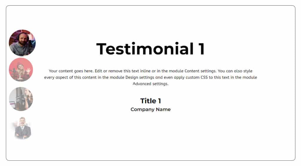
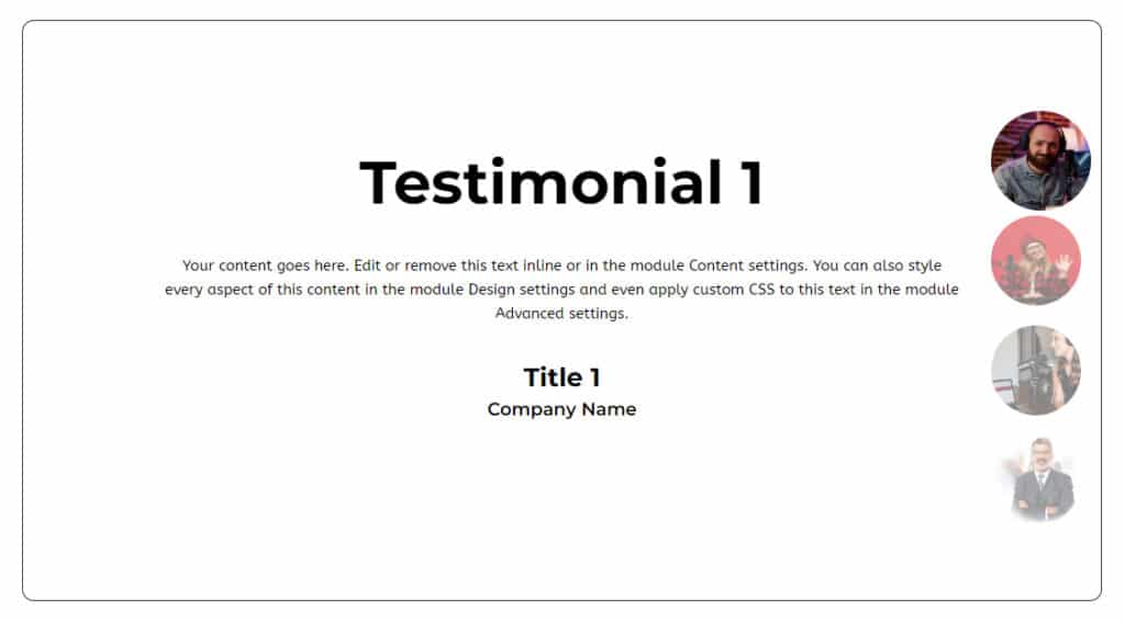
Step 3: Controller Images Showing Left or Right Position
Left position
If you want to show the images in the left position then write this code in the custom CSS field/ code editor field

.et-pb-controllers{
display: flex;
flex-direction: column;
bottom: 11%; //[ you can decide where is suitable, just position your desired need ]
}
.et-pb-controllers a{

Margin: 10px;
}
Right position
If you want to show the images in the right position then write this code in the custom CSS field/ code editor field

.et-pb-controllers{
left: unset;
width: unset;
display: flex;
flex-direction: column;
right: 0;
}
.et-pb-controllers a{
Margin: 10px;
}
Final Verdict on Divi Testimonial Slider
A well-crafted testimonial slider can significantly enhance your website’s credibility and user engagement. With Divi’s powerful customization options, you can create a visually appealing and dynamic slider that highlights authentic customer experiences.
This guide has equipped you with the knowledge to design a Divi testimonial slider that not only looks great but also reinforces trust and social proof. Take advantage of Divi’s flexibility, experiment with different styles, and ensure your testimonials leave a lasting impact.
Start building your testimonial slider today and turn your satisfied customers into your strongest advocates!


0 Comments