Today we’re going to show in this tutorial, how to create a Divi grid layout for the section page with our new Divigrid: Listgrid module.
First, let’s learn a little about the Divi plugin we’ll be using. DiviGrid is a plugin that makes it easy to create a grid without any custom code. So we will show step-by-step how to create a grid using this plugin.
In this article, we will learn about the features of ListGrid and how to use those features to create beautiful ListGrid designs.
We will show you how to create different list grids using the features. The usage of the features will be discussed in detail while creating each ListGrid.
Let’s get started…
List Grid Module Overview
Step – 1: Install Divigrid
- If you haven’t yet, install and activate the Divigrid.
- Create a new page in WordPress and use the Divi Builder to edit the page on the front end (visual builder).
- Choose the option “Build From Scratch”/ “New Section”.
We will create three list grids and show how to create them with our module. So let’s see what kind of list grids we are going to create and what they look like.
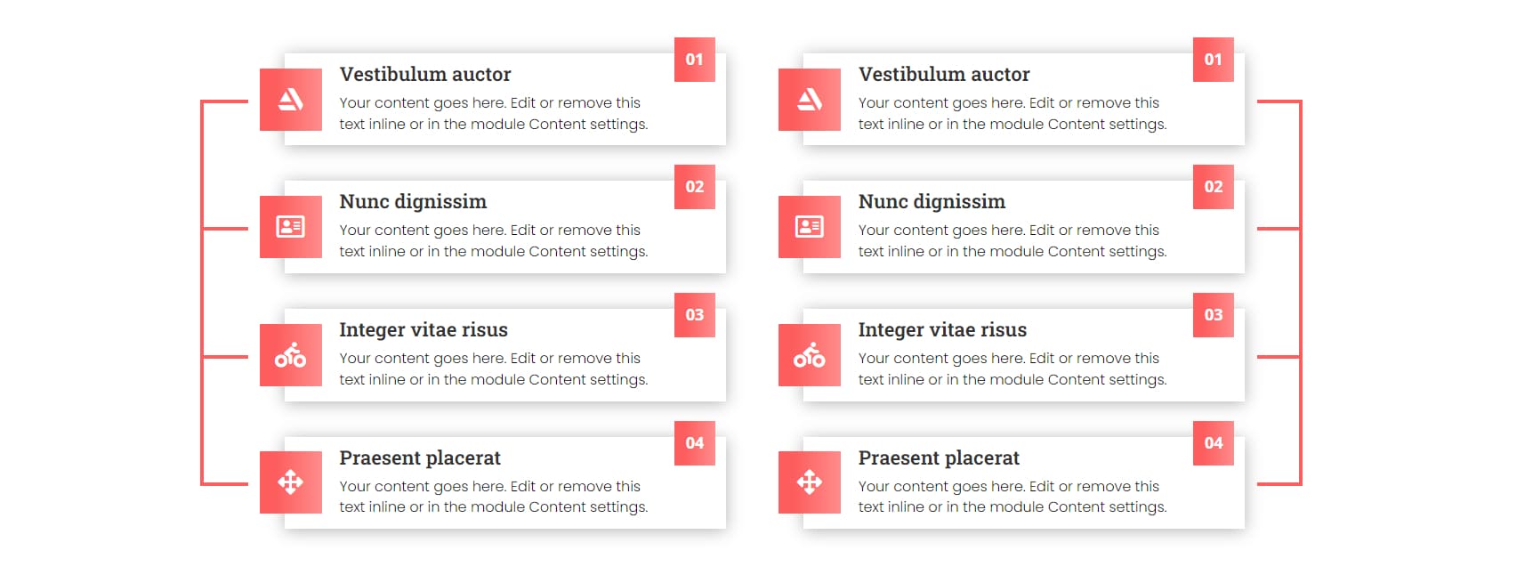
Create List Grid Using Connector
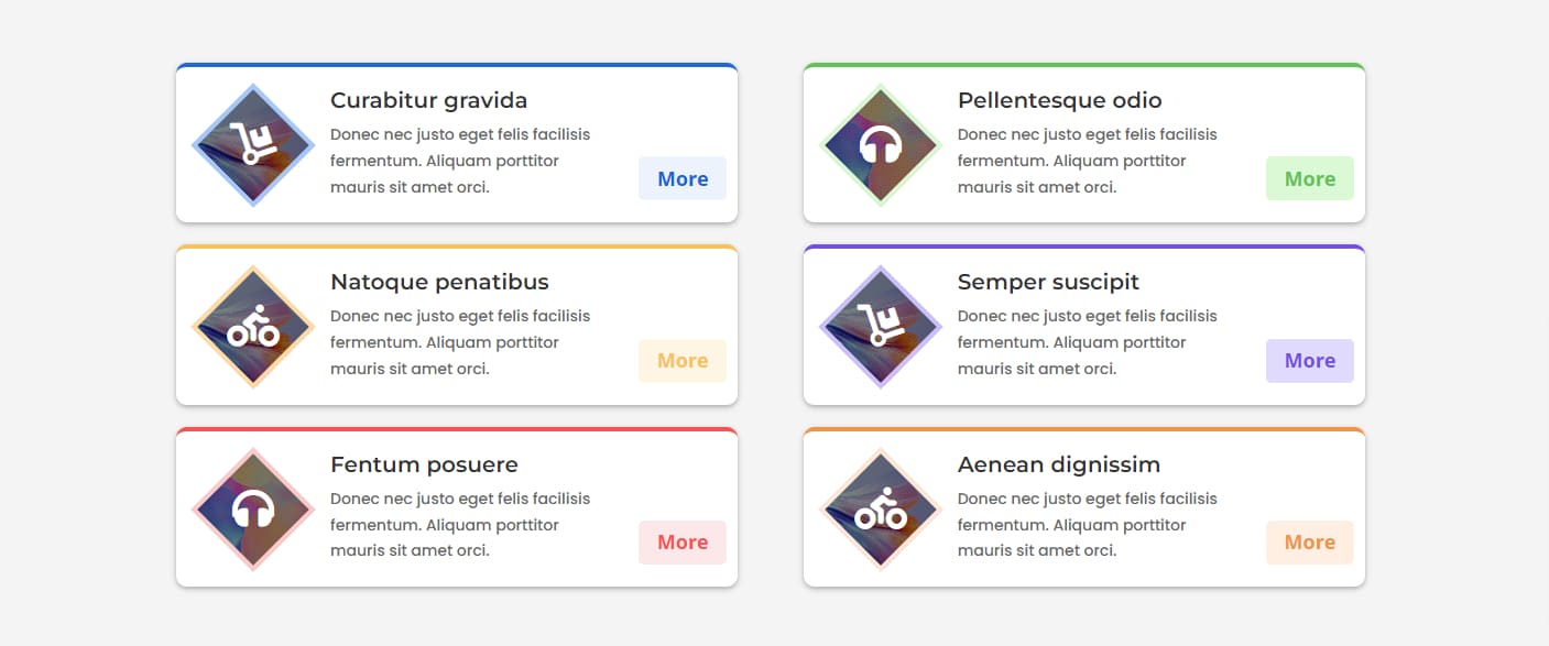
Create List Grid Using Shape & Hover Effects
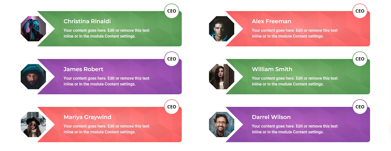
Create Hexagonal Image List Grid Using Shape
The feature we will be working with is called Connector. In this tutorial, we will show how to create a ListGrid and connect multiple ListGrid modules with a connector.
Step -2: Creating a Section Layout
To begin, add a section.
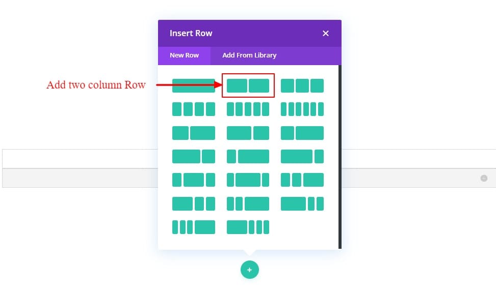
after that, add a two-column row to the section.
Now the Section and its Row are in place.

Step -3: Add Divi ListGrid Module
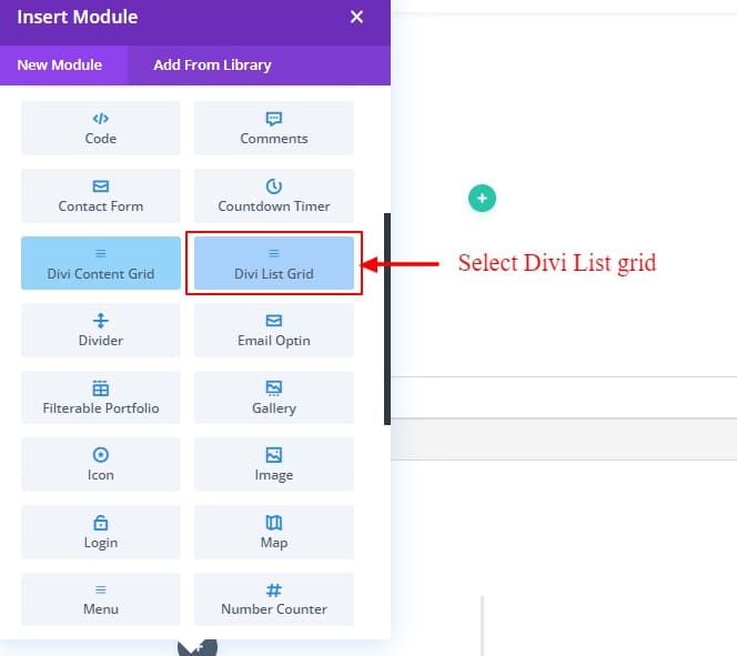
We are ready to add our Divigrid List Grid module. Write “Divi List Grid” in the search box. Add this module to create a responsive list grid module for the page/section.
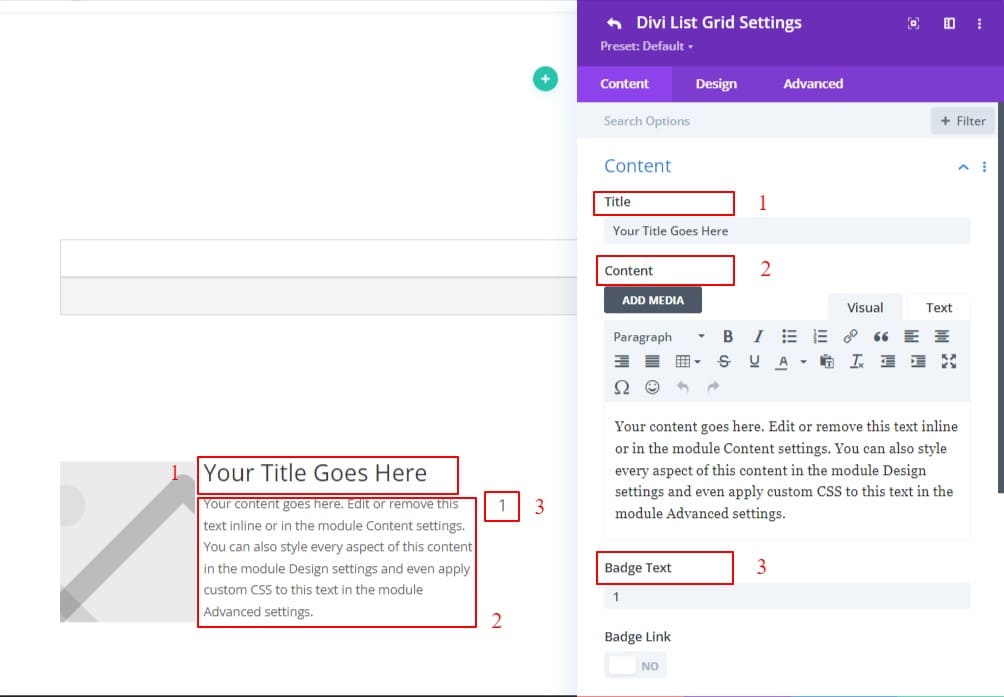
After adding the list grid module, we found an image, title, paragraph, and badge options.
Create List Grid Using Connector
First, we are going to create a list grid using a connector. After adding Divi List Grid Module Change some text for our design.
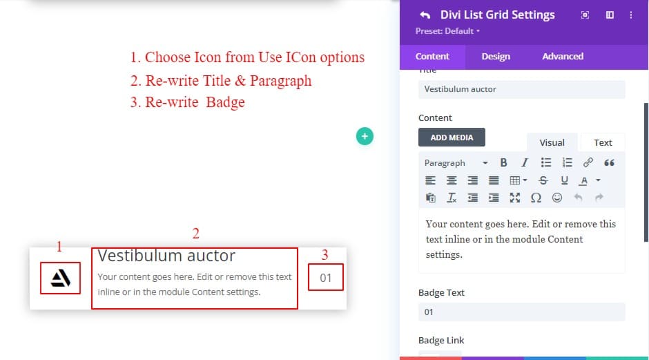
update the content settings of the module as follows:
- Write Title & paragraph text.
- Write badge number/ text.
- Remove the image and use the Icon from the “images & Icon” toggle.
- Use List grid box-shadow from the list grid design tab.
- List grid Item padding: 10px;
Step 4: Customize the item
End of choosing our content, badge, and icon. Now let’s design each piece of content.
Since we will be creating many similar list items, we will design them by going to the Design tab of the List Grid to design all the items together. This will speed up the work and allow us to make any future changes together quickly.
First, update the icon from the “Images & icons settings” of the list grid item in the Design tab. What to change in the icon is written below:
- Icon size : 28px;
- Icon Vertical Alignment: Center;
- Icon color: #FFFFFF;
- Icon width: 70px;
- Icon height: 70px;
- use gradient background: ON;
- 1st COlor: #fd5d5d;
- last color: #ff8c8c;
- gradient type: Linear;
- Gradient direction: 90deg;
- Start position: 25%;
- Icon Container margin-left: -40px;
- Icon Container margin -right 10px;
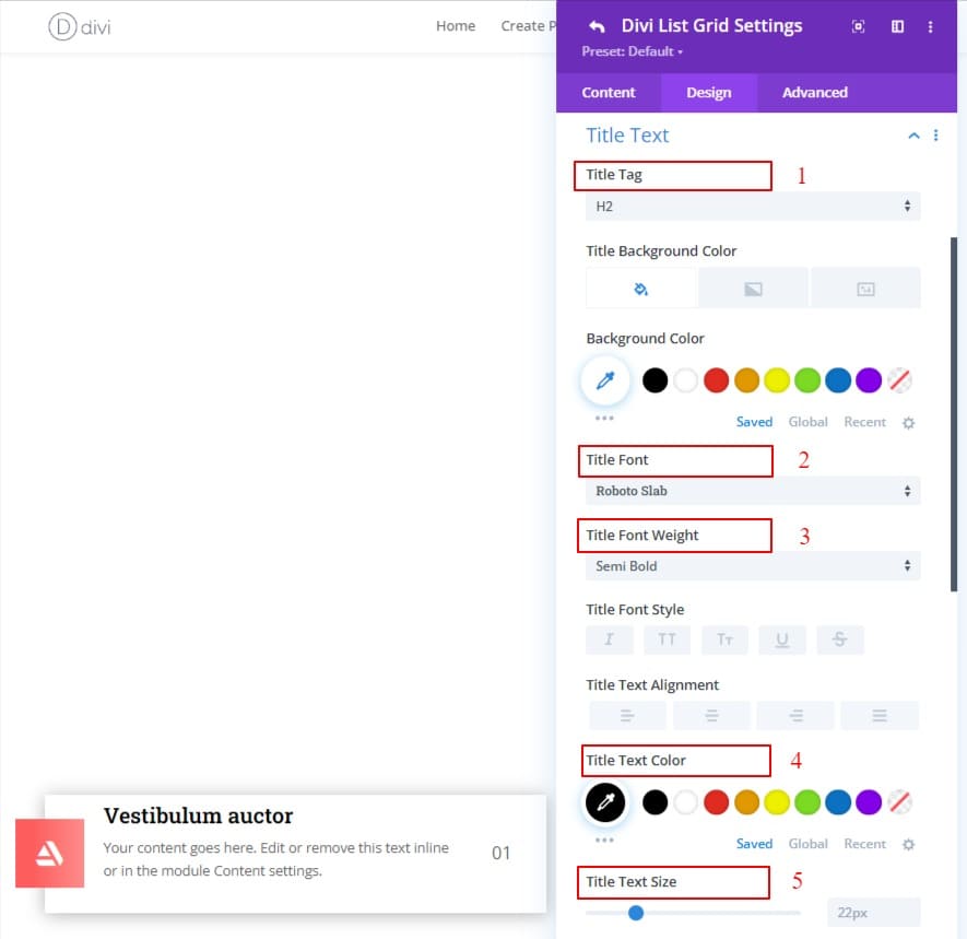
Second, Update the Title from the “Title Text” of the list grid in the design tab. What to change in the title is written below:
- Title tag: H2;
- Title font: Roboto Slab;
- Title font-weight: Semi Bold;
- Text color: #000000;
- Title text size: 22px;
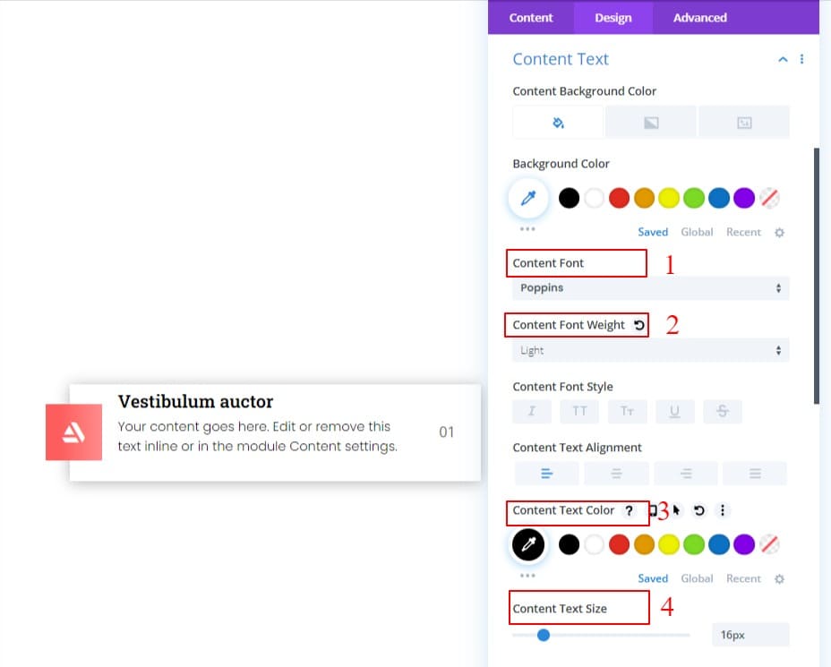
Third, Update the Content from the “Content Text” of the list grid in the design tab. What to change in the content is written below:
- Content font: Poppins;
- Content font-weight: light;
- Content text color: #000000;
- Content text-size: 16px;
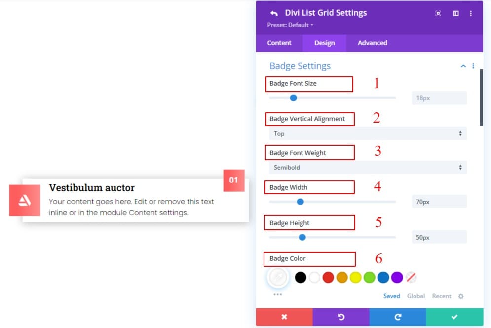
Fourth, Update the Badge from the “Badge Settings” of the list grid in the design tab. What to change in the badge is written below:
- Badge font-size: 18px;
- Badge Vertical Alignment: Top;
- Badge font-weight: Semi Bold;
- Badge width: 70px;
- Badge height: 50px;
- Badge color: #FFFFFF;
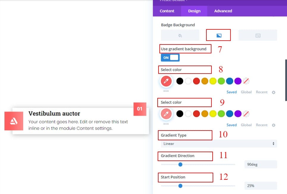
- use gradient background: ON;
- 1st COlor: #fd5d5d;
- last color: #ff8c8c;
- gradient type: Linear;
- Gradient direction: 90deg;
- Start position: 25%;
- Badge Container margin: -30px;
Step 5: Adding Connector
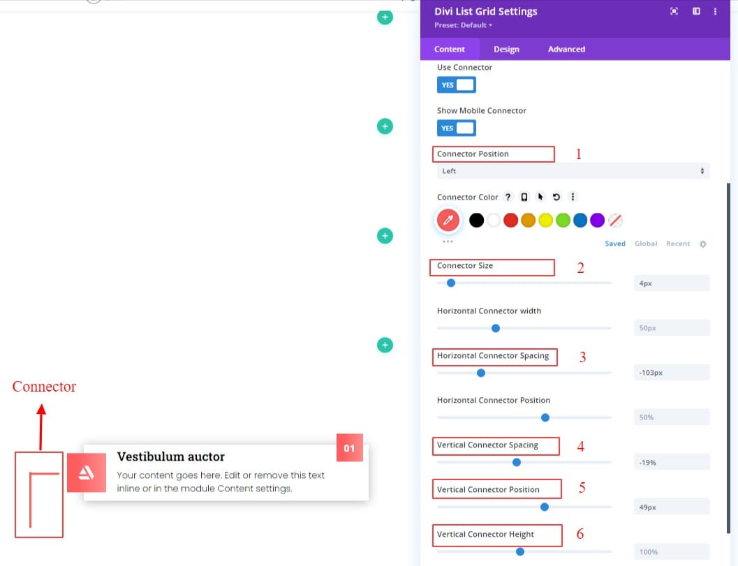
This is the main feature part of this list grid. In the list grid settings content area, we see a toggle named connector. we will now be using and designing it.
Under the connector, there are two switches. If we ON the use connector switch, we will see a bunch of options to design a connector.
We will use the connector on the left of the list for the first column. That is why the work we will do is written below.
- Connector position: Left;
- Connector color: #fd5d5d;
- Connector size: 4px;
- Horizontal connector spacing: -103px;
- Vertical connector spacing; -19%;
- Vertical connector position: 50px;
- Vertical connector height: 434px; ( for all the modules)
Step – 5: Duplicate modules
Hey, Our first module is done. Now we can proceed to the next step. Isn’t that so?
Now, Let’s copy the module we created three times. Now margin bottom should be given as required. Because otherwise, each item will stick to one, which doesn’t look good at all.
- List grid margin-bottom: 44px;
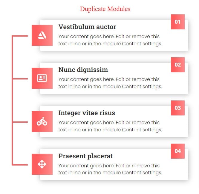
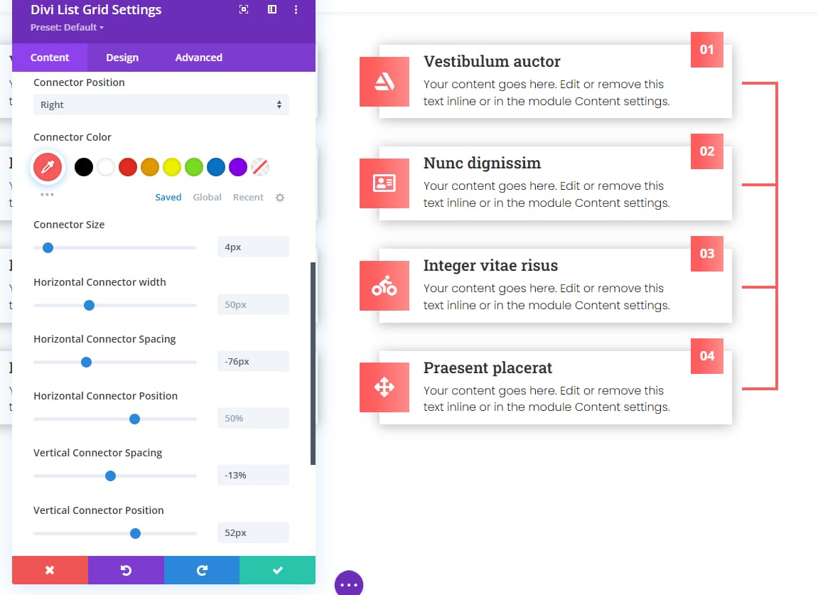
Now, click on module settings and copy the module from there and paste it into the 2nd column. Update the connector settings as follows:
- Connector position: right;
- Horizontal connector spacing: -76px;
- Vertical connector spacing; -13%;
- Vertical connector position: 52px;
- Vertical connector height: 434px; ( Consider for all the modules)
Let’s see both columns together.
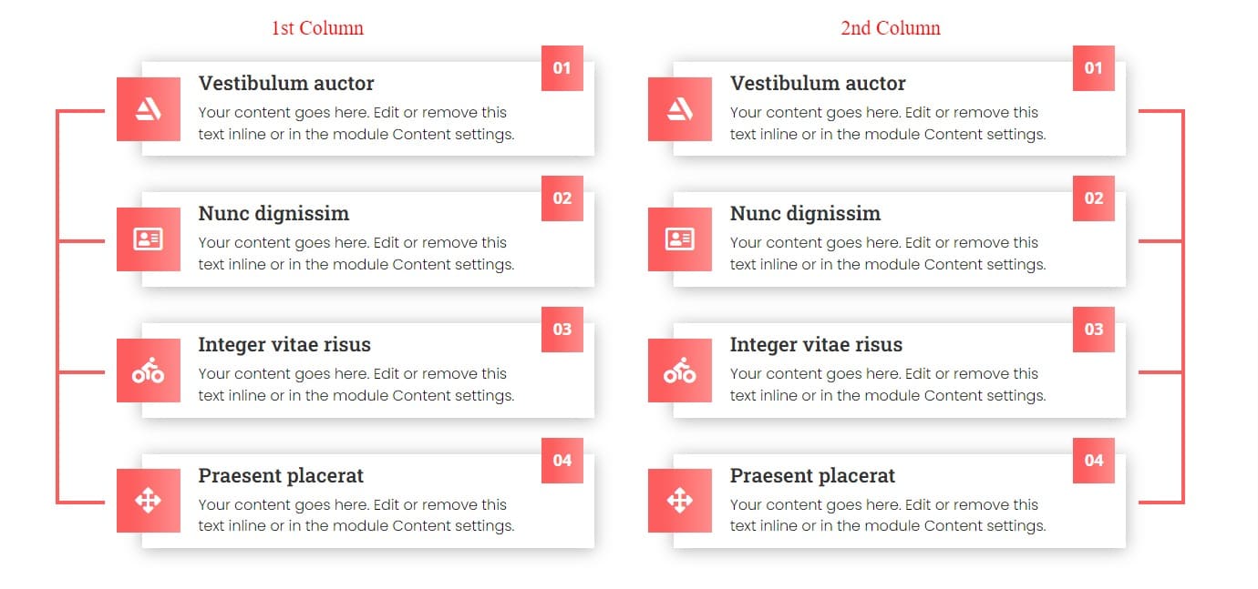
Final Result ( Connector List Grid )
Here is the final result of our first List Grid module. I hope you enjoy this List Grid.

This is the end of our first list grid.
Using Shape & Hover Effects
Now we are starting to create our second module. In this List grid, we are using hover effects and shape features. Hopefully, it will be another fantastic List Grid.
We are starting from step 4 of this article. We start from step 4 of this article. That means we will start after adding the Divi List Grid module. So let’s begin…
Step 4: Customize the item
We are going to create a list grid using a connector. After adding the Divi List Grid Module Change some text for our design.
update the content settings of the module as follows:
- Write Title & Paragraph text.
- Write badge text.
- Remove the image and use the Icon from the “images & Icon” toggle.
- List Grid Item Margin-Bottom: 20px;
- List Grid Item padding:
- List Grid Item padding-top: 20px;
- List Grid Item padding-bottom: 20px;
- List Grid Item padding-left: 30px;
- List Grid Item padding-right: 10px;
- List Grid border Rounded: 10px;
- List Grid Box-shadow: outer shadow;
Using Shape
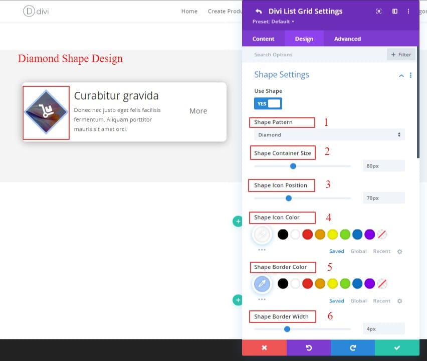
First, We will work on the Icon. We will use the shape on the icon. We will work with the diamond shape of different shapes. From the “Image & Icon” toggle option in the Content Settings, we choose an Icon.
After that, In the Design tab, turn on the Shape Settings switch. I will select the diamond from different shapes. The tasks to be done after selection are written below.
- Shape pattern: Diamond;
- Shape Container size: 80px;
- Shape Icon position: 70px;
- Shape Icon color: #FFFFFF;
- Shape border color: #a4c8fc;
- Shape Border width: 4px;
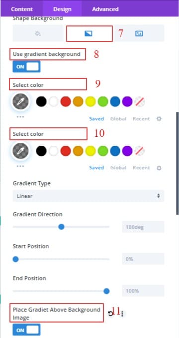
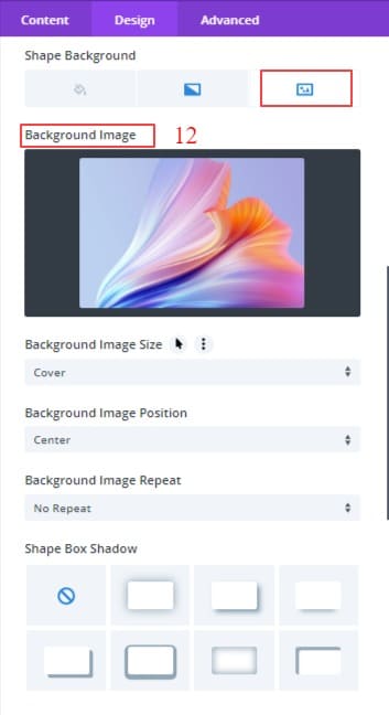
- Shape background: Background Image;
- Use background Gradient: ON;
- Select First color: rgba(0,0,0,0.5);
- Select Last color: rgba(0,0,0,0.5);
- Place Gradient Above Background Image: ON;
- Add Background Image.
Background Gradient color and Background image settings here in those pictures.
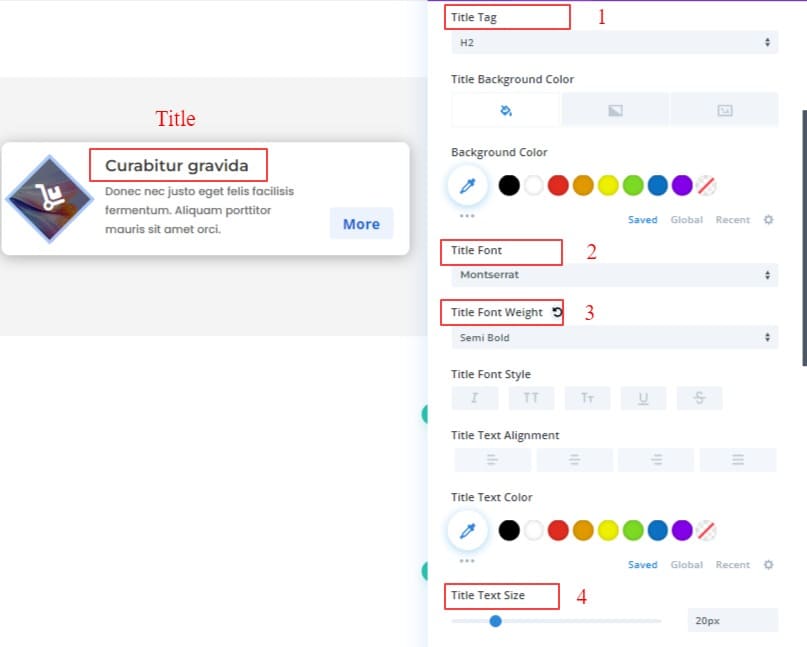
Second, Update the Title from the “Title Text” of the list grid in the design tab. What to change in the title is written below:
- Title Tag: H2;
- Title Font: Montserrat;
- Title Font-weight: Semi Bold;
- Title text size: 20px;
Third, Update the Content from the “Content Text” of the list grid in the design tab. What to change in the content is written below:
- Content Font: Poppins;
- Content Text Size: 14px;
- Content Wrapper Spacing(
- Content Wrapper margin-left: 20px;
- Content Wrapper Margin-right: 20px;)
Fourth, Update the Badge from the “Badge Settings” of the list grid in the design tab. What to change in the badge is written below:
- Badge font-size: 18px;
- Badge Vertical Alignment: Bottom;
- Badge font-weight: Semi Bold;
- Badge width: 80px;
- Badge height: 40px;
- Badge Color: #1665d8;
- Background Color: #ecf3fc;
- Badge Rounded Corners: 5px solid;
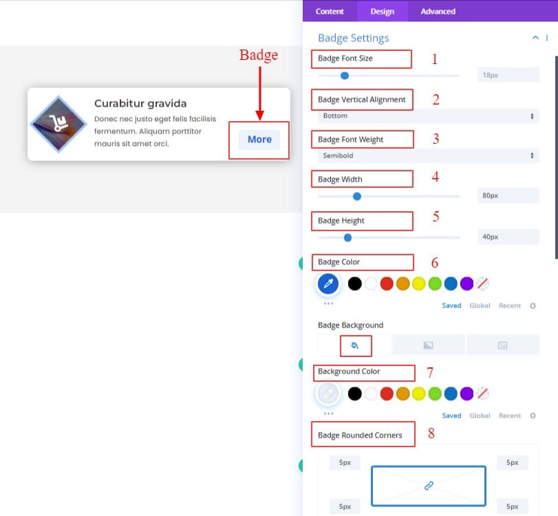
Fifth, Update the Border style from the “Border” of the list grid item in the design tab. What to change in the border is written below:
- Border Style: Top Border;
- Top Border Width: 4px;
- Top Border Color: #1e6ad9;
Step – 5: Use Hover Effects
In the List Grid Settings Design Tab, there is a toggle named Hover Effects.
After opening, Choose Hover Effects Style “overlay”. And Update the Hover Effects Styles from the ” Hover Effects” options. What to change in the hover effects is written below:
- Hover Effects Style: Overlay;
- Overlay Style: Diagonal Swipe;
- Overlay Color: #b8fff9;
- Overlay Size: 400px;
- Overlay Title Color: #000;
- Overlay Content Color: #000;
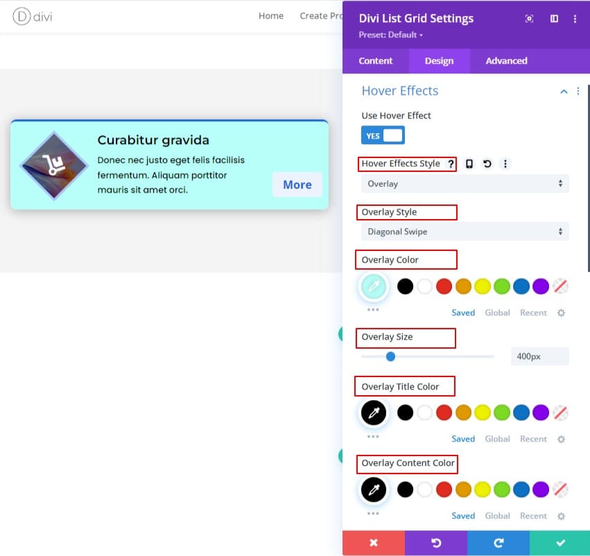
Step – 6: Duplicate modules
Hey, Our first module is done. Now we can proceed to the next step. Isn’t that so?
Now, Let’s copy the module we created two times. Now margin bottom should be given as required. Because otherwise, each item will stick to one, which doesn’t look good at all.
ListGrid Item margin-bottom: 20px;
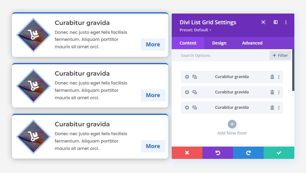
Update the rest of the Items as follows:
2nd Item
Here, we are changing List Grid Items’ top border color, Icon border color, and badge color. What needs to be changed is written down.
- Change Icon
- Re-write Title & Paragraph.
- Change Shape Background Image,
- Shape Border Color: #ffdba3;
- Top Border Color: #f6c25b;
- Badge Color: #f6c25b;
- Badge Background Color: #fff5e2;
3rd Item
The same changes should be made in the 3rd item. Only the colors will be different.
- Change Icon
- Re-write Title & Paragraph.
- Change Shape Background Image,
- Shape Border Color: #fcc9c9;
- Top Border Color: #f85252;
- Badge Color: #f85252;
- Badge Background Color:#fce8e8;
Second & Third Item in one image.
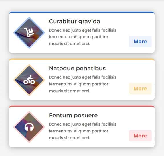
Now, click on module settings and copy the module from there and paste it into the 2nd column. Update the items as follows:
2nd Column 1st Item
We have written below the changes that have taken place in the 1st row of the 2nd column.
- Change Icon
- Re-write Title & Paragraph.
- Change Shape Background Image,
- Shape Border Color: #d8f9d1;
- Top Border Color: #60c354;
- Badge Color: #60c354;
- Badge Background Color:#daf9d4;
2nd Column 2nd Item
- Change Icon
- Re-write Title & Paragraph.
- Change Shape Background Image,
- Shape Border Color: #cbbffc;
- Top Border Color: #744ee2;
- Badge Color: #744ee2;
- Badge Background Color:#e0dbfc;
2nd Column 3rd Item
- Change Icon
- Re-write Title & Paragraph.
- Change Shape Background Image,
- Shape Border Color: #ffe7d6;
- Top Border Color: #f19445;
- Badge Color:#f19445;
- Badge Background Color:#ffeee2;
Our List Grid is done. Now, let’s both columns together.
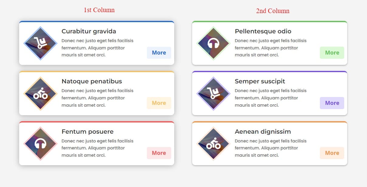
Final Result List Grid ( Shape)
Here is the final result of our second List Grid module. I hope you enjoy this List Grid.
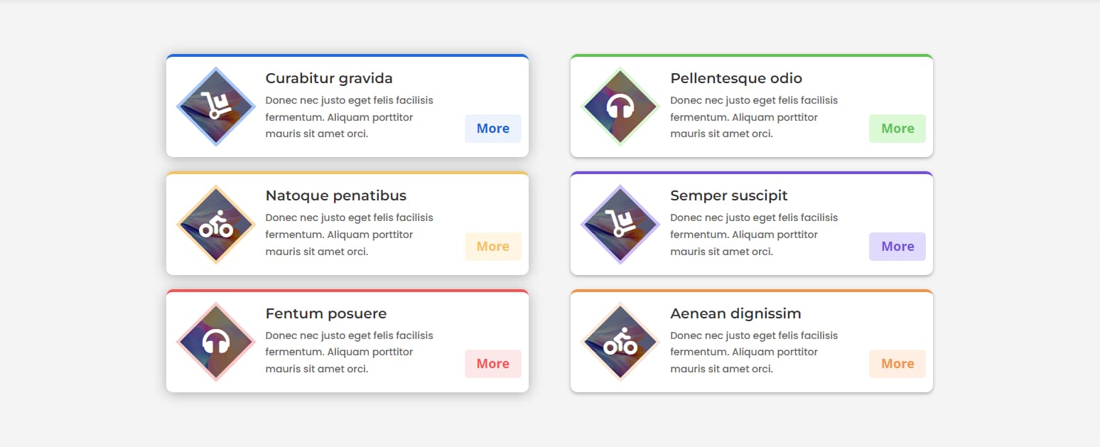
Create a Hexagonal Image Using Shape
After creating two awesome list grids, we are now going to create the third and final grid.In this grid article, we will try to show how to give a hexagonal shape to an image using our shape settings.
A review of this grid shows that we need to do the same things we did with the content and badges of the previous two list grids. So to shorten our article, I will not show the content and badge settings step by step. I will show it once and write the CSS with it.
In this article, we will show step by step how to make an image hexagonal with our shape feature and item background settings. Hope you can easily understand.
So Let’s start another journey with List Grid Module…….
Customize the Item
After selecting the Divi List Grid from the module selection option, place the title, description, badge text, and image. For the sake of speed, we are not showing them for now. Hope you understand. Then the tasks to be done are discussed step by step.
First, we are going to customize an item, then we will customize an Image to a hexagonal shape. We will choose the background gradient color from the item background option. Also we will choose a background mask from another background option.
- Gradient First Color: #83bd75;
- Gradient Last Color: #4e944f;
- Gradient Type: Elliptical;
- Background Mask: cubes;
- Pattern Color: rgba(0,0,0,0.05);
- pattern Repeat Origin: Top Right;
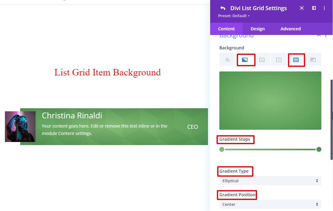
After that, turn on Use Shape by going to the list grid item’s Shape Settings toggle. Then from the Shape Pattern Select option ‘Diamond; must choose After choosing the pattern you need to do the work carefully for a beautiful design. Or you can follow our CSS below.
- Use shape: ON;
- Shape pattern: Diamond;
- Shape Container Size: 120px;
- Shape Border Color: #FFFFFF;
- Shape Border Width: 10px;
- Shape Background Color: #FFFFFF;
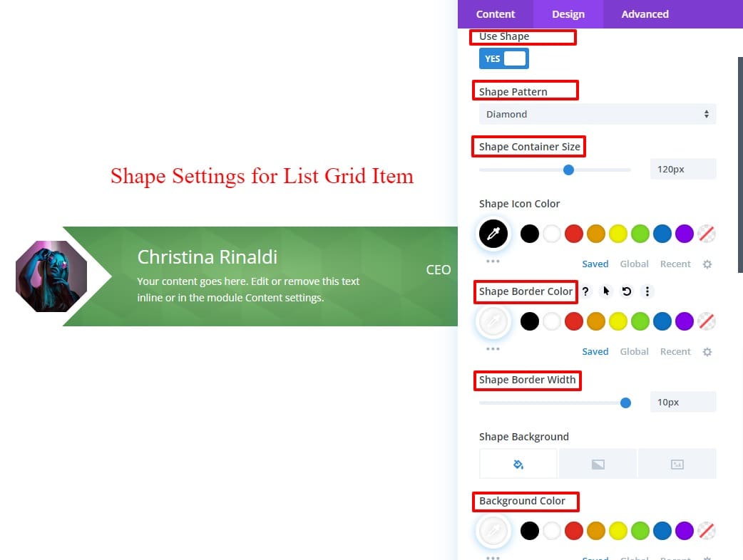
It became a hexagonal image shape. Very simple isn’t it?
But it looks weird. Add some padding and margin from “Spacing” in “Div List Grid Settings” to make this grid look nice. For ease of understanding, you can follow the code below.
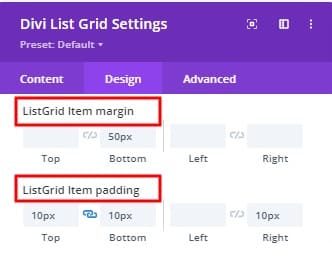
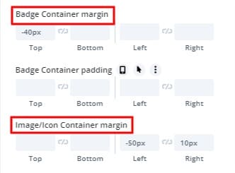
- List Grid Item Margin Bottom: 50px
- List Grid Item Padding top: 10px
- List Grid Item Padding bottom: 10px
- List Grid Item Padding left: 0px
- List Grid Item Padding right: 10px
- Image/Icon Container Margin left: -50px;
- Image/Icon Container Margin right: 10px;
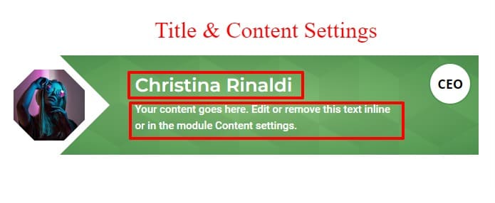
The required CSS for the title and content are written below.
- Title Tag: H2;
- Title Font: Montserrat;
- Title Font Weight: Semi Bold;
- Content Font: Roboto;
- Content Font Weight: Regular;
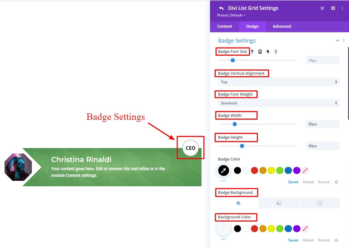
A lot of work has to be done on the badge. Go to the Design tab of the Divi List Grid Item Settings and follow the steps below.
- Badge Vertical Alignment: Top;
- Badge Font Weight: Semi Bold;
- Badge width: 60px;
- Badge Height: 60px;
- Badge Color: #000000;
- Badge Background Color: #FFFFFF;
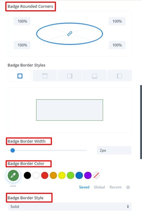
- Badge Rounded Corners: 100%;
- Badge Border width: 2px;
- Badge Border Color: #4e944f;
Now, Let’s copy the module we created two times. Use different colors and images. The look of the design will emerge well.
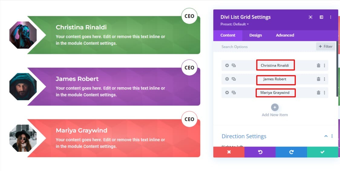
Here now again, click on module settings and copy the module from there and paste it into the 2nd column. Do the necessary things.
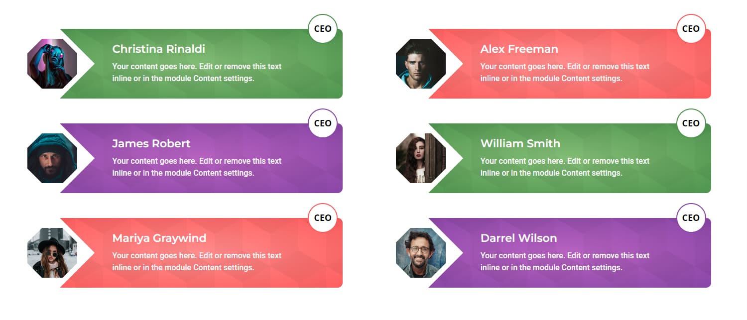
Here we go, let’s see our hexagonal module.
We’ve created three grids with our Divi List Grid module. If you want to create a grid without any custom code, our list grid is the best solution for you. You can create many more beautiful designs using our modules.
Conclusion
If you want to see our list grid demo design please visit list grid demos


0 Comments