The Divi content grid is a powerful and versatile tool that allows you to easily create responsive column-based content. With the Divi content grid, you can control the number of columns, the size of the columns, and the spacing between them. This makes it easy to create beautiful and evenly-spaced content layouts.
The Divi content grid is also extremely fast and lightweight, which means it won’t slow down your site. And, it’s easy to use and customize, so you can create exactly the layout you want.
Today we’re going to show in this tutorial, how to create a Divi grid layout for the product section page with our new Divigrid: Contentgrid module.
First, let’s learn a little about the Divi plugin we’ll be using. DiviGrid is a plugin that makes it easy to create a grid without any custom code. So we will show step by step how to create a grid using this plugin.
Let’s get started…
Here is a Full Video
At the beginning of the article, let’s see what kind of grid we are going to create for our product section.
This section is the full Responsive Grid Layout section.

Step 1: Install Divigrid
First, you will need to do the following:
- If you haven’t yet, install and activate the Divigrid.
- Create a new page in WordPress and use the Divi Builder to edit the page on the front end (visual builder).
- Choose the option “Build From Scratch”.
Step 2: Creating a section layout
To begin, add a regular section.
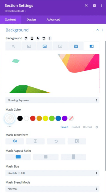
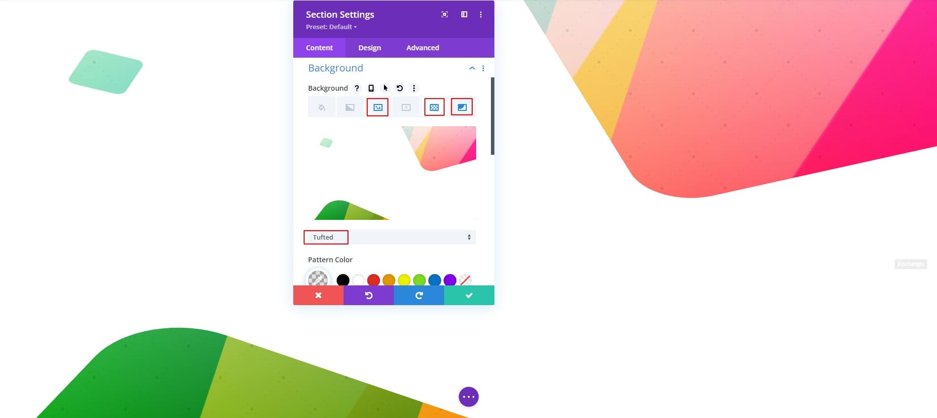
Open the section settings and update the background as follows:
-
background image: Choose what you like;
-
background pattern: tufted;
- background mask: Floating Squares;
- Mask color: white;
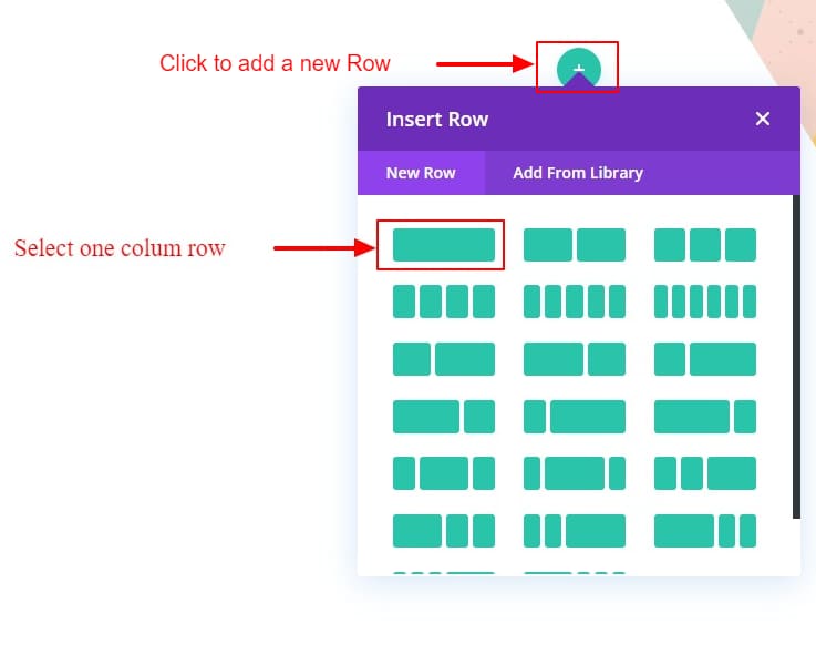
After the Section styles are in place, add a one-column row to the section.
Now the Section and its Row are in placed.[photo]
Step:3 Add Divi Content Grid Module
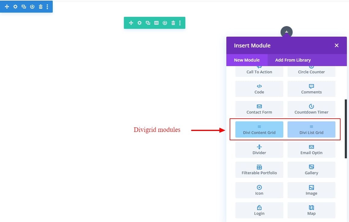
We are ready to add our Divigrid module. Write “Divi Content Grid” in the search box. Add this module to create a responsive grid module for the product page/section.
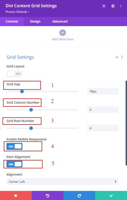
After opening the Divi Content Grid module, we added 8 new items & update the content settings for the items as follows:
- Grid gap: 10px;
- Grid column number: 4;
- Grid row number; 4;
- Enable mobile responsive: ON;
- Item alignment: ON;
Step 4: Customize the item
We finished taking items for our grid. We have completed a fantastic job, haven’t we?
Alright, For the grid we will create, we will now set the content of each item separately and design accordingly.
First, update the content settings for all items as follows
- Remove title, subtitle, and paragraph text.
- Re-write title/ subtitle/ paragraph
- Delate image from image/Icon.
- Add background image.
- Border radius: 10px solid;
Spacing (parent/global):
- (Item Container Padding)
- 1. Padding-top: 50px;
2. Padding-bottom: 50px;
3. Padding-left: 20px;
4. Padding-right: 20px;
First Item
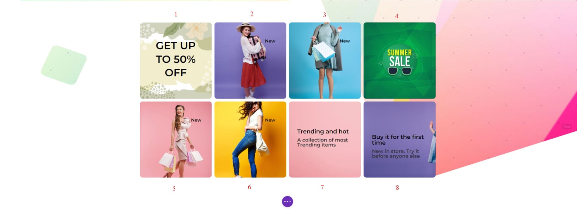
If we look at the picture of the grid, we can see that the first grid goes from column 1 to column 3. With that
The background takes the height according to the height of the image. Item Alignment is used to bring our title right in the middle. To make the first module as shown in the picture, what we need to do is written below.
update the content settings for the First item as follows:
First Item Content Settings:
- Rewrite title.
- In Grid settings, there have two new tabs named column and row.
a. Column.
Grid column start: 1;
Grid column end: 3;
b. Row
Grid row start: auto;
Grid row end: auto; - Item position
Item alignment: Center;
Design Settings
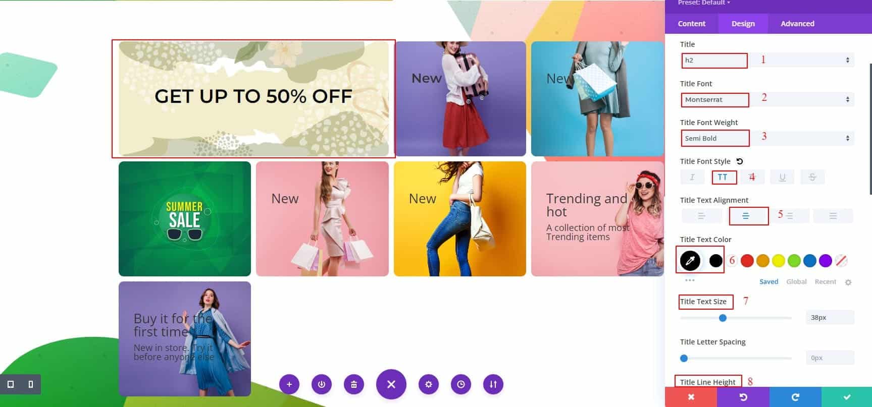
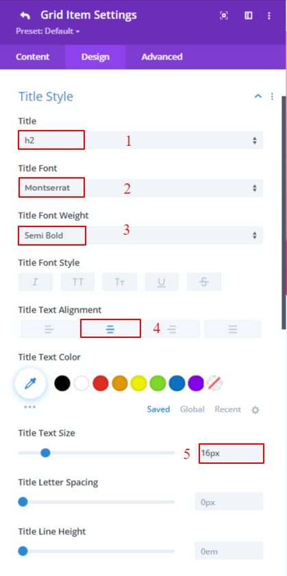
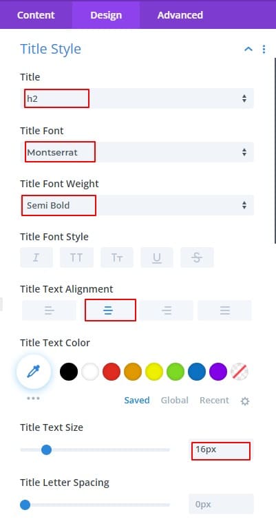
- Title tag: H2;
- Title font: montserrat;
- Title font-weight: Semi Bold;
- Title font style: TT;
- Title text alignment: Center;
- Color: #000000;
- Title text size: 38px;
- Title line height: 1.3em;
Second Item
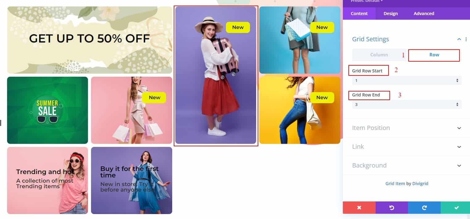
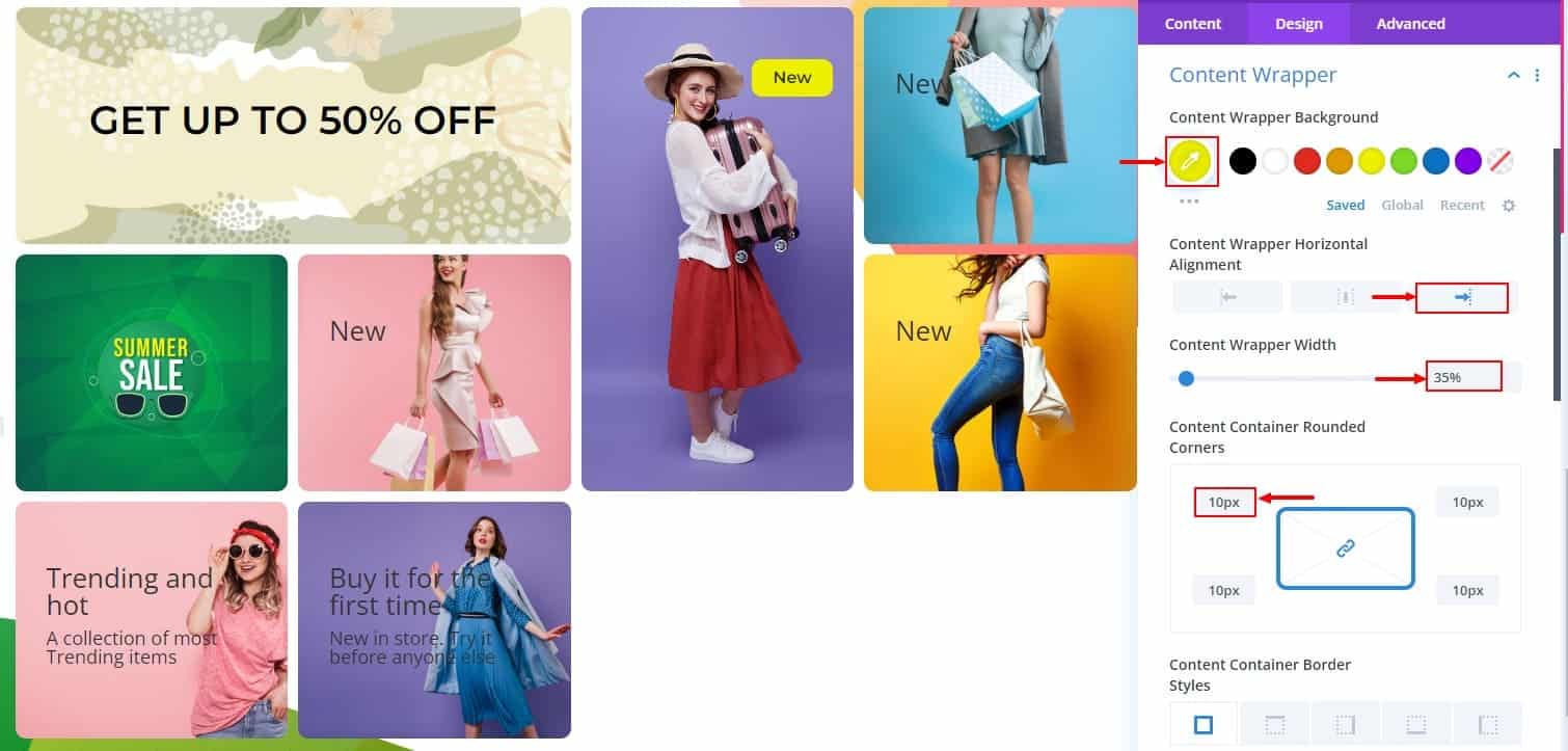
In the second module, we have to work on Row. After setting the grid row start, grid row end, and background image. We need to do some work with the content wrapper to get the title in the right place. It should give a nice shape with padding, margin, wrapper width, background, and border radius. Applying the following CSS will complete the second module.
Update the settings as follows:
For the Second Item Content settings:
- Rewrite title.
- In Grid settings, there have two new tabs named Column and Row.
a. Column.
Grid column start: 3;
Grid column end: auto;
b. Row
Grid row start: 1;
Grid row end: 3; - Item position
- Item alignment: Top Right;
Design Settings
Title Settings
- Title tag: H2;
- Title font: Montserrat;
- Title font weight: Semi Bold;
- Title font style: TT;
- Title text alignment: Center;
- Color: #000000;
- Title text size: 16px;
- Title line height: 0;
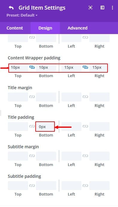
- Title padding-bottom: 0;
Content Wrapper Settings
- Content wrapper background: #EDF000;
- Content wrapper width: 35%;
- Content wrapper horizontal alignment: Right;
- Content container rounded corners: 10px;
- Content wrapper padding-top: 10px;
- Content wrapper padding-bottom: 10px;
- Content wrapper padding-left: 15px;
- Content wrapper padding-right:15px:
Third Item
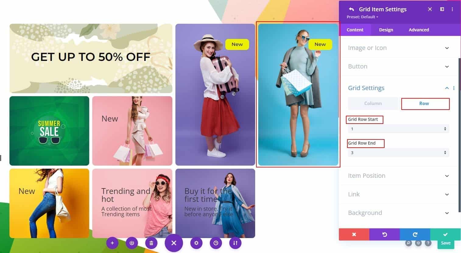
The third item is the same as the second item just change the grid column start. The rest of the CSS will be exactly the same as the 2nd item.
- Rewrite title.
- In Grid settings, there have two new tabs named Column and Row.
a. Column.
Grid column start: 4;
Grid column end: auto;
b. Row
Grid row start: 1;
Grid row end: 3; - Item position
Item alignment: Top Right;
Design Settings:
Same as Second Item Desing settings.
Fourth Module Item
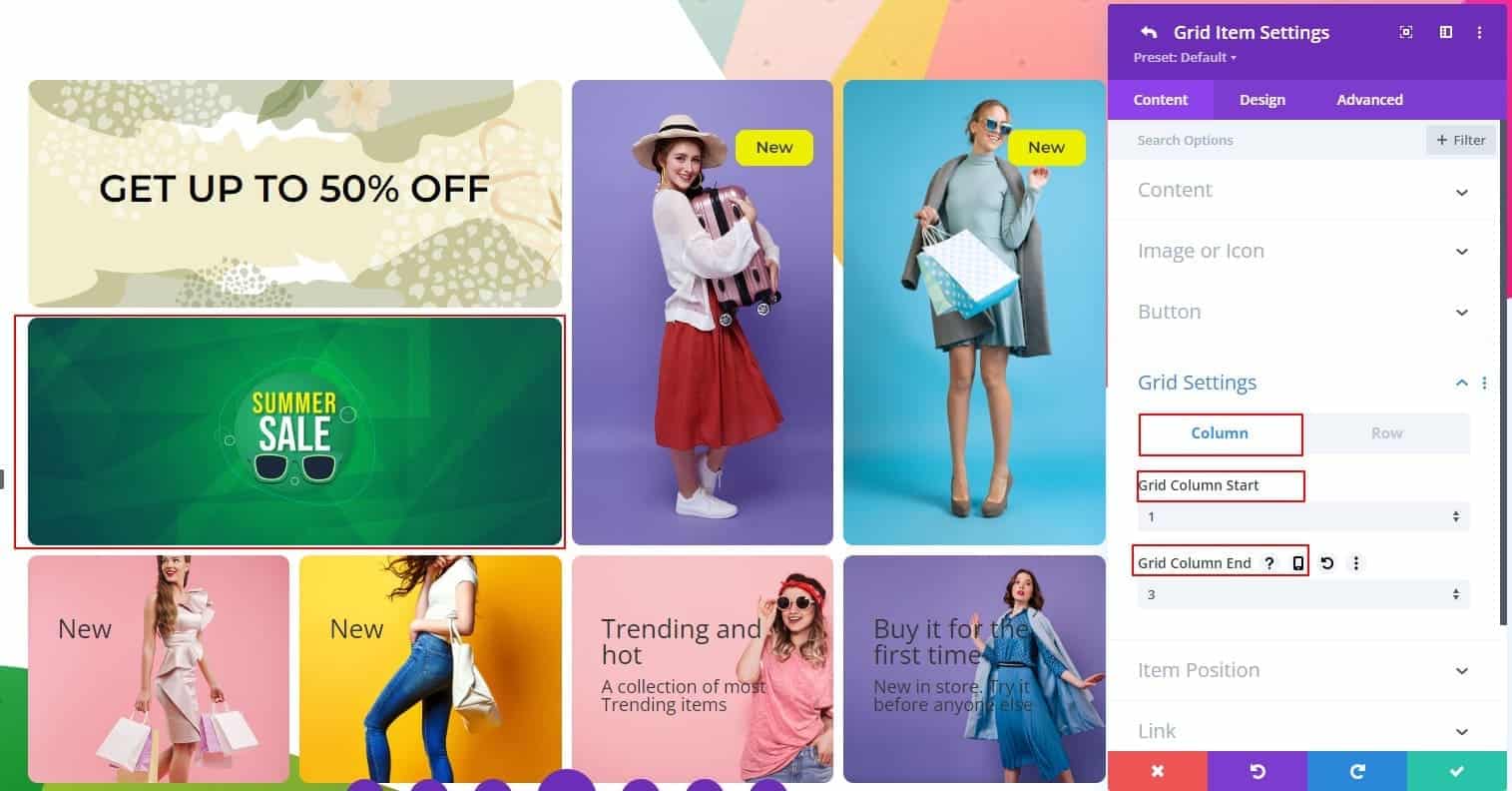
Looking at the 4th item, it can be seen that the 1st item is the same as the module. 1st module has a title but the 4th module item does not. No other changes. CSS from 1st module should be applied here.
- In Grid settings, there have two new tabs named Column and Row.
a. Column.
Grid column start: 1;
Grid column end: 3;
b. Row
Grid row start: auto;
Grid row end: auto;
Fifth & Sixth Item
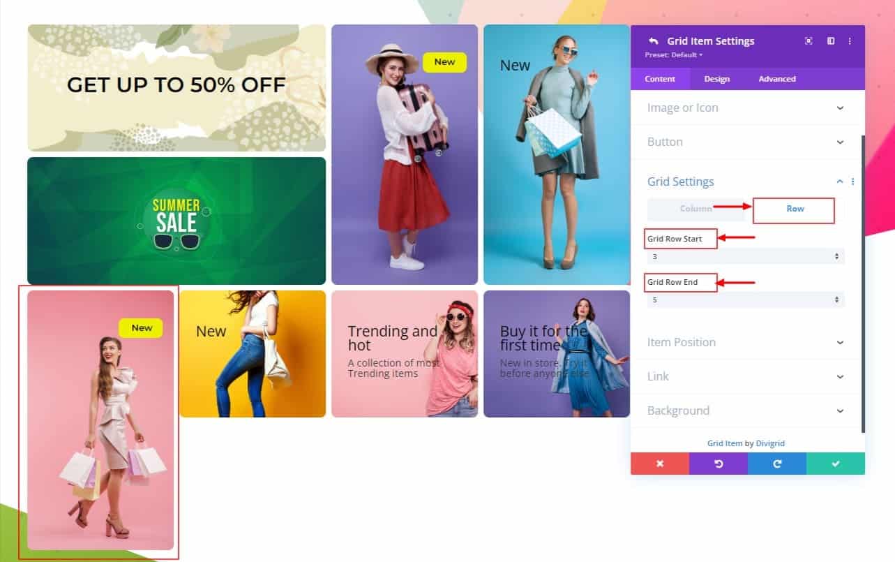
The Fifth and sixth module items are the same as 2nd and 3rd module items. Only columns and rows need to be changed. Other than that, the CSS is all the same.
Fifth Item:
- Rewrite title.
- In Grid settings, there have two new tabs named Column and Row.
a. Column.
Grid column start: auto;
Grid column end: auto;
b. Row
Grid row-start 3;
Grid row-end: 5; - Item position
Item alignment: Top Right;
Design Settings:
Follow the Second Design Item Settings.
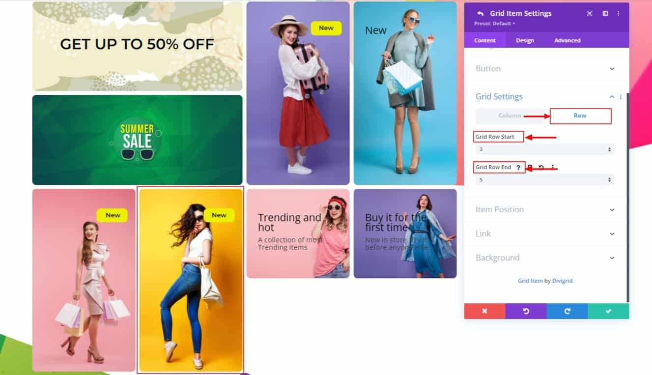
Sixth Item:
- Rewrite title.
- In Grid settings, there have two new tabs named Column and Row.
a. Column.
Grid column start: auto;
Grid column end: auto;
b. Row
Grid row-starts: 3;
Grid row-end: 5; - Item position
Item alignment: Top Right;
Design Settings
Title Settings
- Title tag: H2;
- Title font: Montserrat;
- Title font-weight: Semi Bold;
- Title font style: TT;
- Title text alignment: center;
- Color: #000000;
- Title text size: 16px;
- Title line-height: 0;
- Title padding-bottom: 0;
Content Wrapper Settings
- Content wrapper background: #EDF000;
- Content wrapper width: 35%;
- Content wrapper horizontal alignment: Right;
- Content container rounded corners: 10px;
- Content wrapper padding-top: 10px;
- Content wrapper padding-bottom: 10px;
- Content wrapper padding-left: 15px;
- Content wrapper padding-right:15px:
Seventh & eighth Item
The seventh and eighth items are the same as 1st and fourth items. Grid Column Start and Grid Column End need to be changed.
Rewrite titles and subtitles and change item alignment. To simplify the task, change your CSS like the below CSS code.
Seventh Item:
- Rewrite title.
- Rewrite the subtitle.
- In Grid settings, there have two new tabs named Column and Row.
a. Column.
Grid column start: 3;
Grid column end: 5;
b. Row
Grid row starts: auto;
Grid row-end: auto; - Item position
Item alignment: Center Left;

Design Settings:
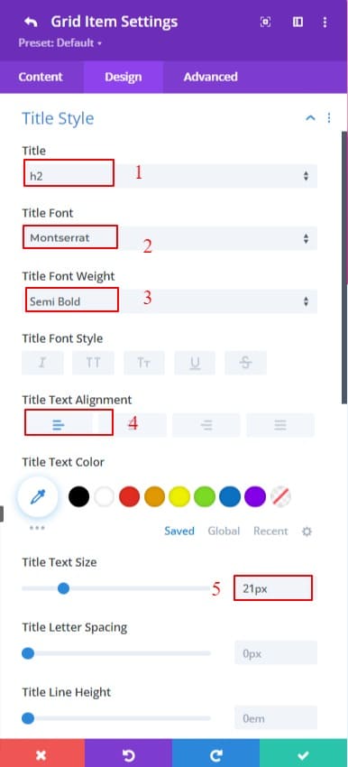
Title Settings:
- Title Tag: H2;
- Title Font: Montserrat;
- Title Font Weight: Semi Bold;
- Title Text Alignment: left;
- Color: #000000;
- Title Text Size: 21px;
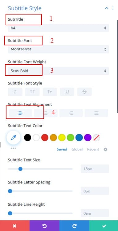
Subtitle Settings:
- Title Tag: H4;
- Title Font: Montserrat;
- Title Font Weight: Semi Bold;
- Title Text Alignment: left;
- Color: default;
- Title Text Size: 18px;
- Background Position: Top Left;
Eighth Item:
- Rewrite title.
- Rewrite subtitle.
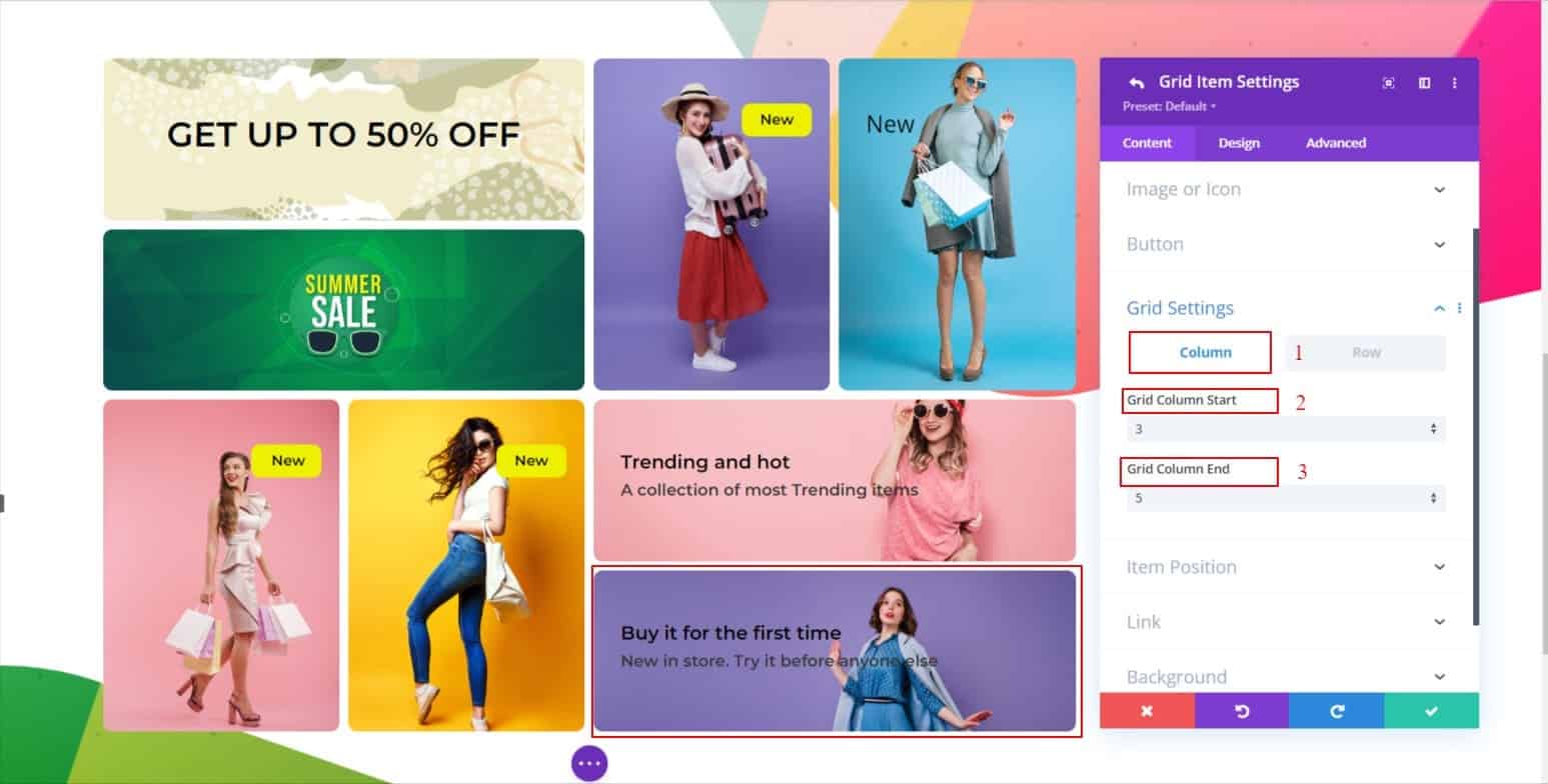
- In Grid settings, there have two new tabs named Column and Row.
a. Column.
Grid column start: 3;
Grid column end: 5;
b. Row
Grid row start: auto;
Grid row end: auto; - Item position
Item alignment: Center Left;
Design Settings:
The seventh and the Eighth Design Settings are the same.
Final Result
Here is the final result of our custom CSS grid layout by our Divi Content Grid Module.

In conclusion, the DiviGrids ContentGrid Module can be a powerful tool when used in WooCommerce. It allows you to control the number of products displayed on a page, as well as the spacing between them. By using the module’s built-in settings, you can create a unique grid layout that will make your store stand out from the rest.
If you want to see our content grid demo design please visit Content Grid Demos





0 Comments