Creating a CSS Grid layout for Divi modules can significantly enhance your website’s design and functionality. While Divi provides a robust set of tools for building layouts, the flexibility of CSS Grid allows for even more precise and dynamic arrangements of your content. In this guide, we’ll walk you through the process of implementing CSS Grid within Divi, enabling you to achieve seamless and responsive grid layouts. Whether you’re aiming for a more sophisticated design or simply looking to streamline your content presentation, this tutorial will equip you with the techniques needed to master CSS Grid in Divi. Let’s get started and elevate your web design game to the next level.
Attention all web designers and Divi enthusiasts! Have you ever wondered how to create a stunning five-column layout using CSS Grid in Divi? Look no further! Our team has put together a comprehensive tutorial that will guide you step-by-step through the process.
Not only have we provided a complete grid layout for your convenience, but we’ve also included Divi’s built-in design options to make the process even easier. By following our guidelines, you’ll be able to effortlessly create a beautiful grid layout using Divi Builder.
Are you ready to elevate your web design game? Let’s dive in and discover the endless possibilities of CSS Grid with Divi!
Here is a Full Video
Step 1: Add a Section
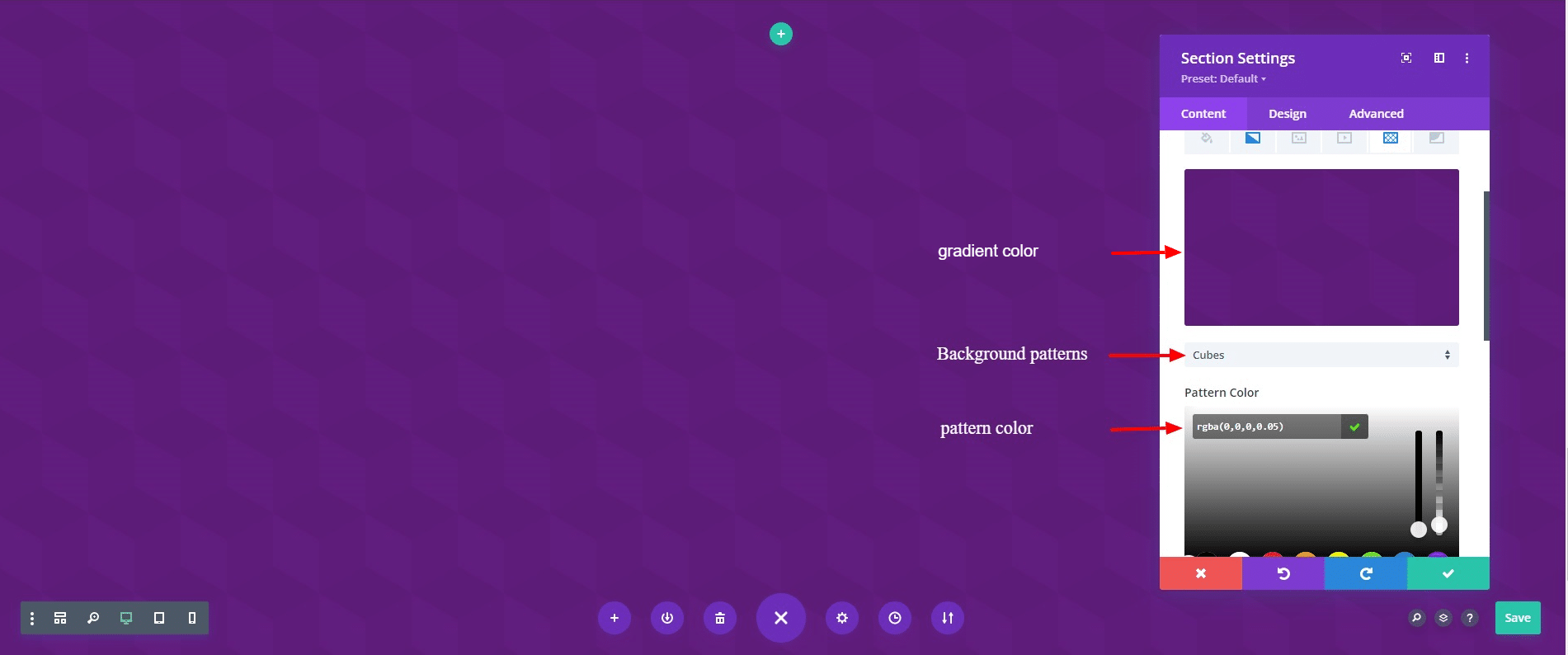
To start, first, add a section and then update the content settings of the section as follows:
- Background pattern: Cubes.
- Gradient color:
- Gradient first color ( 0% ): rgba(89,17,119,0.95);
- Gradient middle color (50%): rgba(148,69,142,0.92);
- Gradient last color (100%): rgba(89,17,119,0.95);
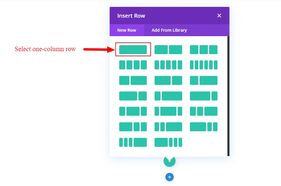
Step 2: Adding Modules to a Divi Column
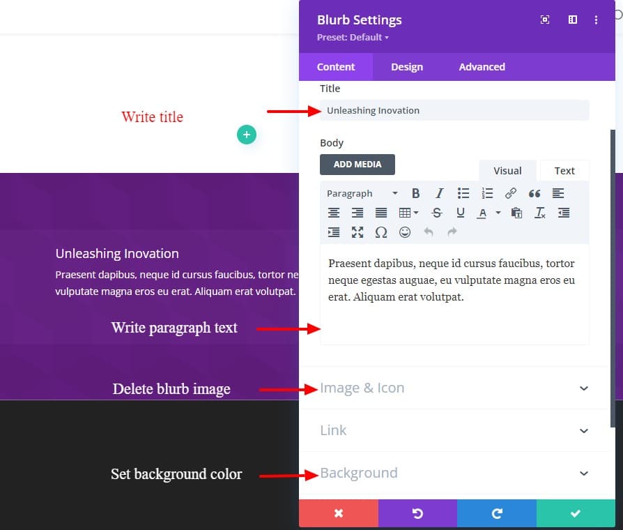
Step 3: Creating a module for grid layout
- Write the title and paragraph text.
- Background color: rgba(144,79,193,0.1)
- Delate image.
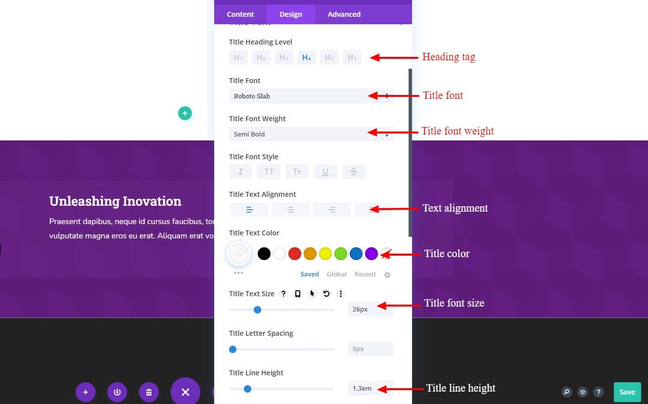
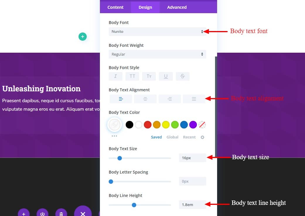
then update the design settings as follows:
- Change the heading tag to H4.
- Title font: Roboto slab.
- Title font-weight: Semi Bold.
- Text alignment: Left.
- Text color: #ffffff.
- Title line-height: 1.3em.
- Body font: Nunito.
- Body text color: #ffffff.
- Body line-height: 1.8em.
- Padding-bottom: 20px.
- Title font-size: 26px.
- Body text font-size: 16px.
Step 4: Duplicate the modules
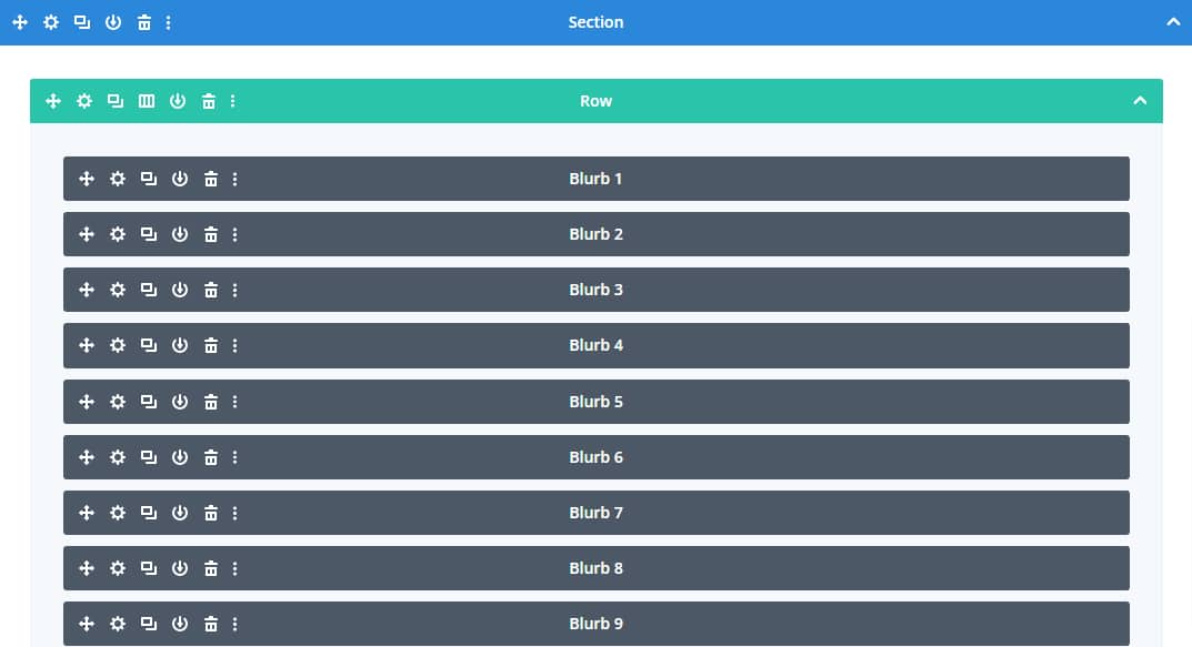
Duplicate the module 9 times and then update the modules as follows.
- Rewrite title.
- Remove body text
- Add icon ( Choose the icon you like )
- Update background color.
- Title text-align: Center.

Step 5: Creating CSS Grid Layout
Now that our modules are in place, we are ready to create our CSS Grid for those modules.
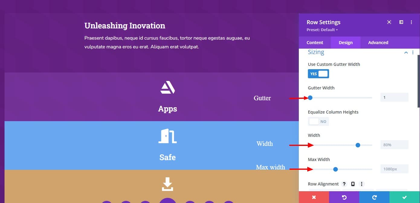
After creating modules and then we need to start designing the Row. Under the Row Settings tab, define the background color, gutter, width, and max-width. Also, in the Content tab change the background color, border radius, and box shadow.
Background:
background gradient color:
- First color: rgba(106,36,177,0.7);
- Second color: rgba(152,82,193,0.7);
- gradient type: Linear;
Sizing
- gutter: 1;
- width: 80%;
- max-width: 1200px;
spacing:
- padding-top: 50px;
- padding-bottom: 50px;
- padding-left: 50px;
- padding-right: 50px;
Box-shadow
- box-shadow: 0px 2px 18px 0px;
- shadow color: rgb(255 255 255 / 40%);
Step 6. Adding Custom Code to create a grid layout
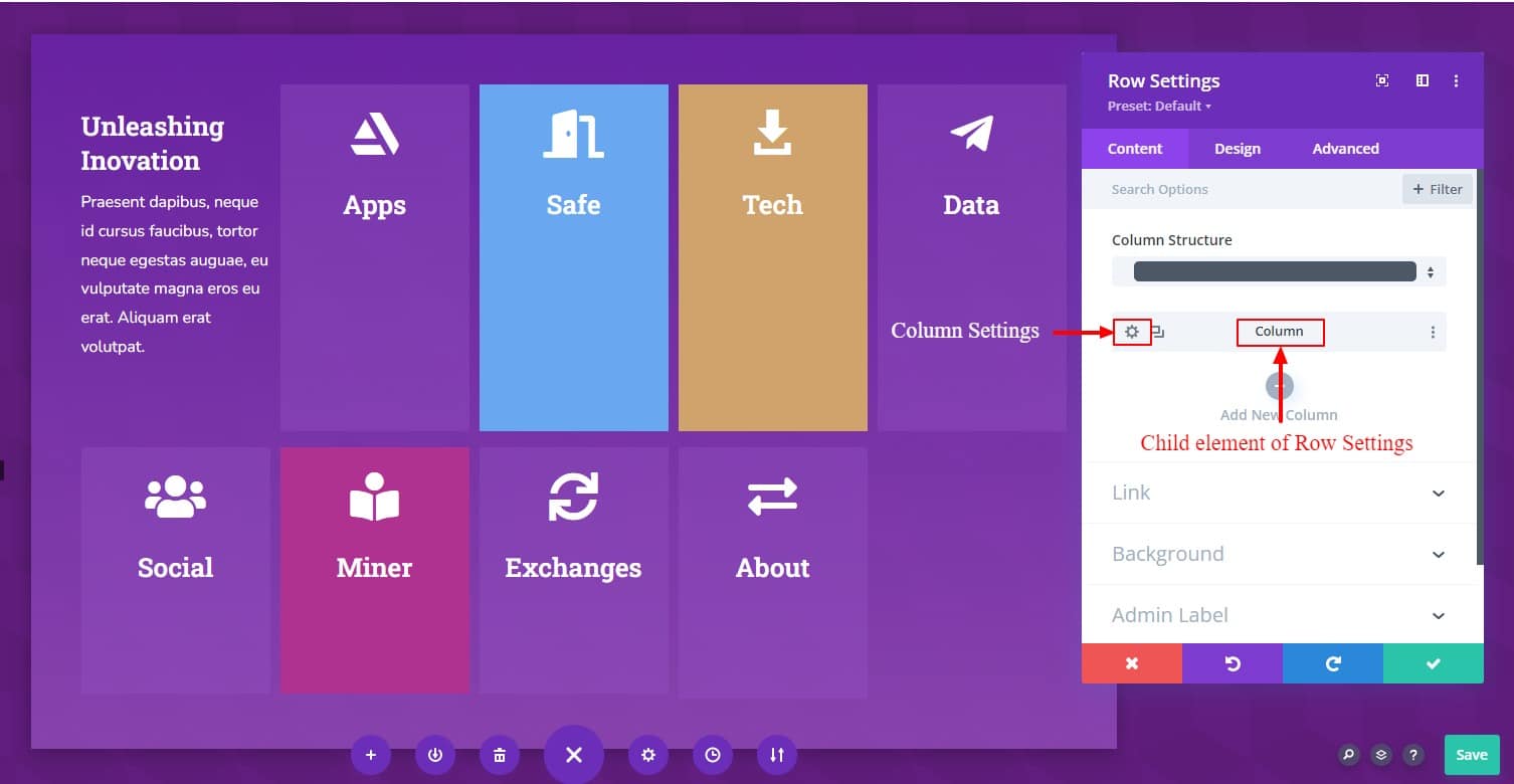
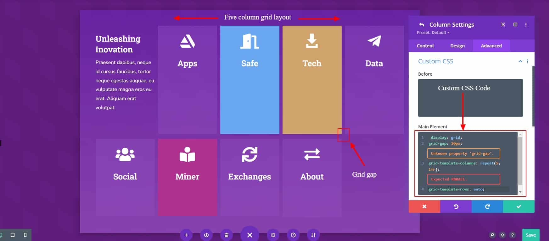
Open the column settings and under the advanced tab, enter the following four lines of custom CSS code in the main element field of custom CSS
This code will create a five-column grid with equal widths and 10px of space between each column.
- display: grid;
- grid-template-columns: repeat(5, 1fr);
- grid-template-rows: auto;
- grid-gap: 10px;
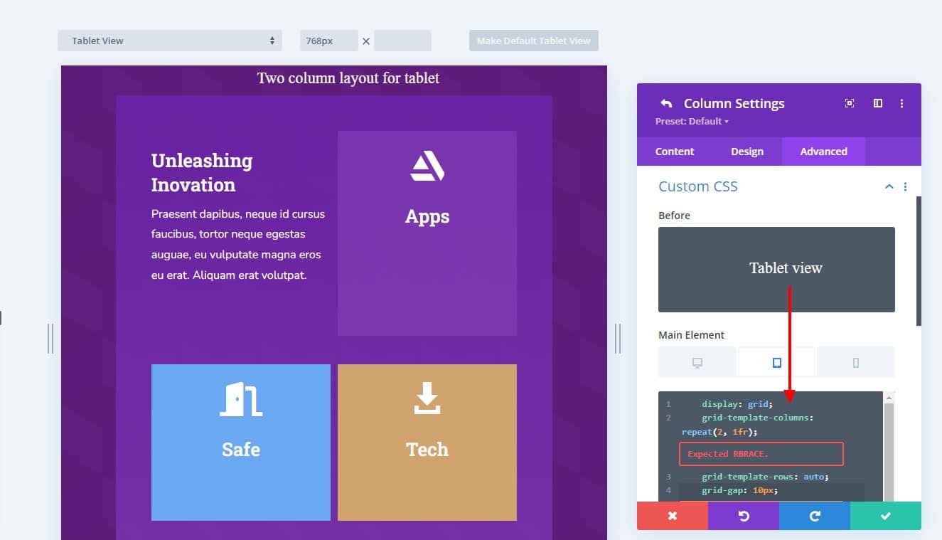
Responsive Tablet view
- display: grid;
- grid-template-columns: repeat(2, 1fr);
- grid-template-rows: auto;
- grid-gap: 10px;
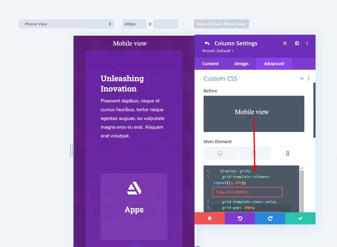
Responsive Mobile view
- display: grid;
- grid-template-columns: repeat(1, 1fr);
- grid-template-rows: auto;
- grid-gap: 10px;
Step 7: Making Changes to the Grid Modules
Now, You need to write custom code in each module separately to create the design layout you want. For your ease of understanding, Don’t worry Divigrid lovers, we have given the code with the image of how to write custom code to design.
To change the position of a module (or grid item) in the CSS grid, we can specify where we want to place a particular module in the grid. Since grid items work by enumerating grid lines, we can determine the position of grid items by using grid column start, grid column end, grid row start, and grid row end.
For where each of your columns will start and end, write the grid-column-starts and grid-column-ends CSS in the main element field of the module’s custom code.
Similarly, rows will also need grid-row-starts and grid-row-ends.
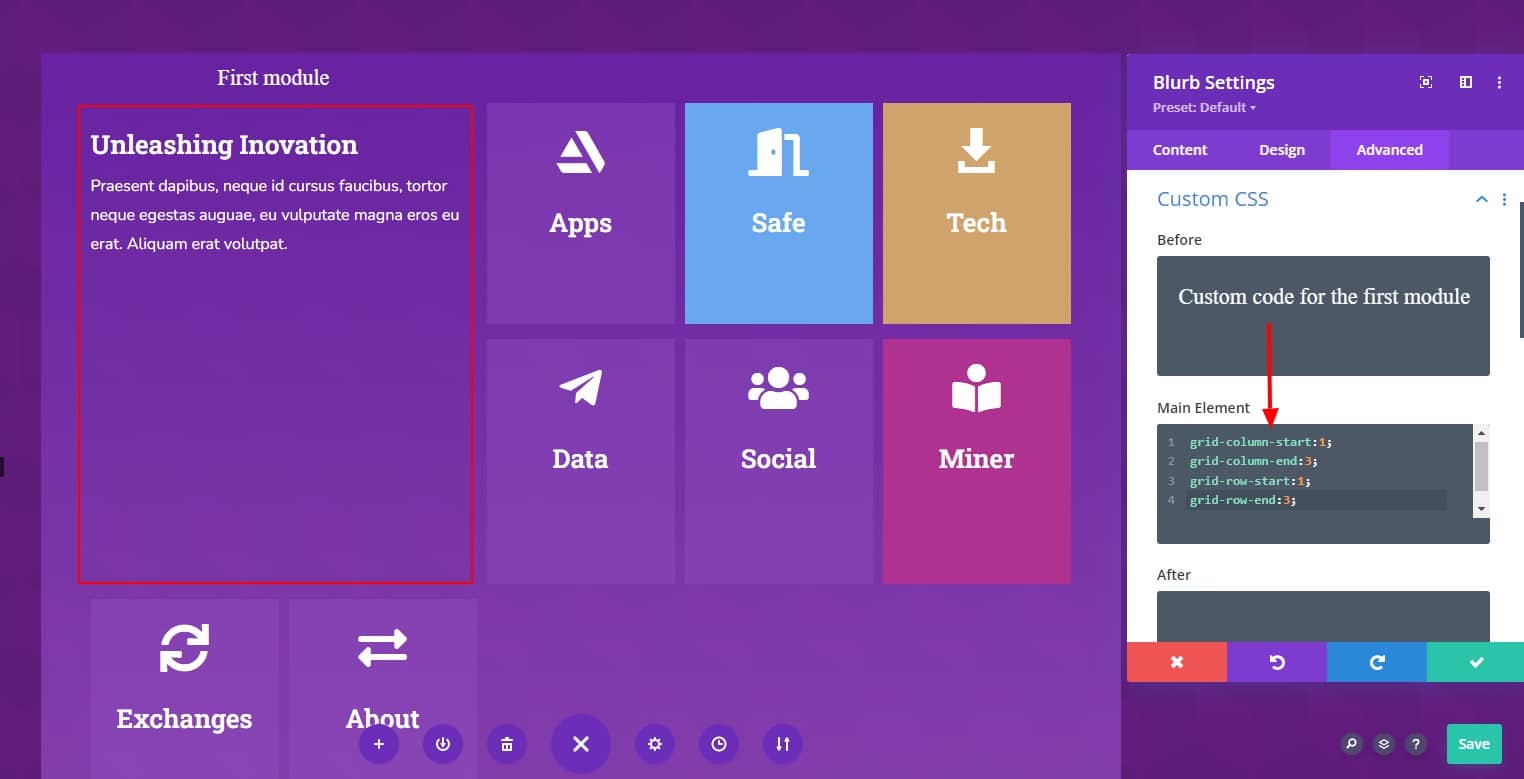
Custom CSS for First module (Unleashing Inovation):
Open the settings for the first module ( Unleashing Inovation ) and write the following custom CSS to the main element:
- grid-column-start: 1;
- grid-column-end: 3;
- grid-row-start: 1;
- grid-row-end: 3;
Custom CSS for Second module(Apps):
Open the settings for the Second module ( Apps ) and write the following custom CSS to the main element:
- grid-row-start: auto;
- grid-row-end: auto;
- grid-column-start: auto;
- grid-column-end: auto;
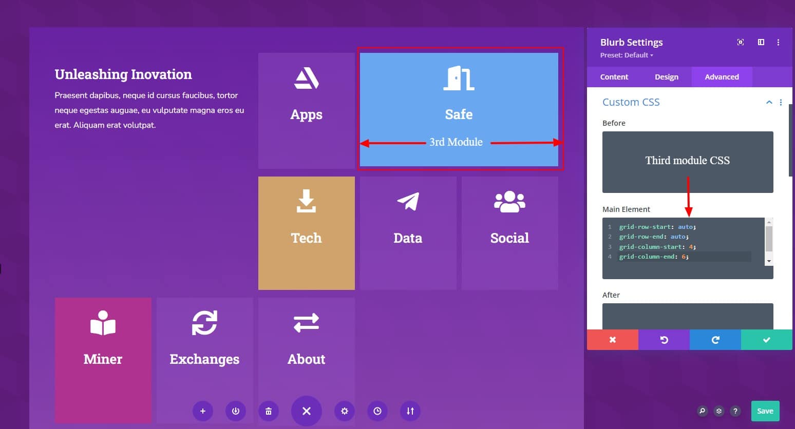
Custom CSS for 3rd module(Safe):
Again, open the settings for the Third module ( Safe ) and write the following custom CSS to the main element:
- grid-row-start: auto;
- grid-row-end: auto;
- grid-column-start: 4;
- grid-column-end: 6;
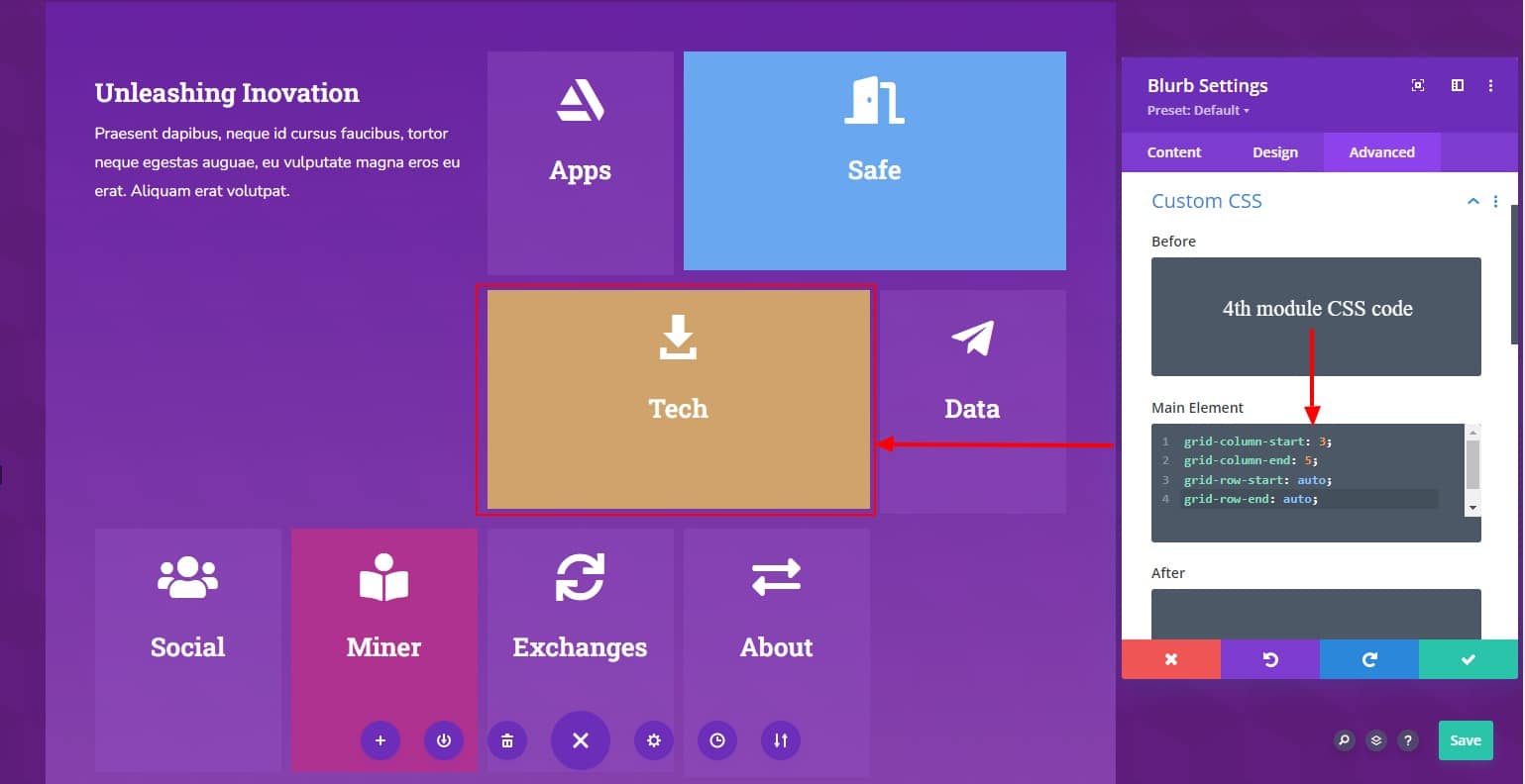
Custom CSS for 4th module (Tech):
- grid-column-start: 3;
- grid-column-end: 5;
- grid-row-start: auto;
- grid-row-end: auto;
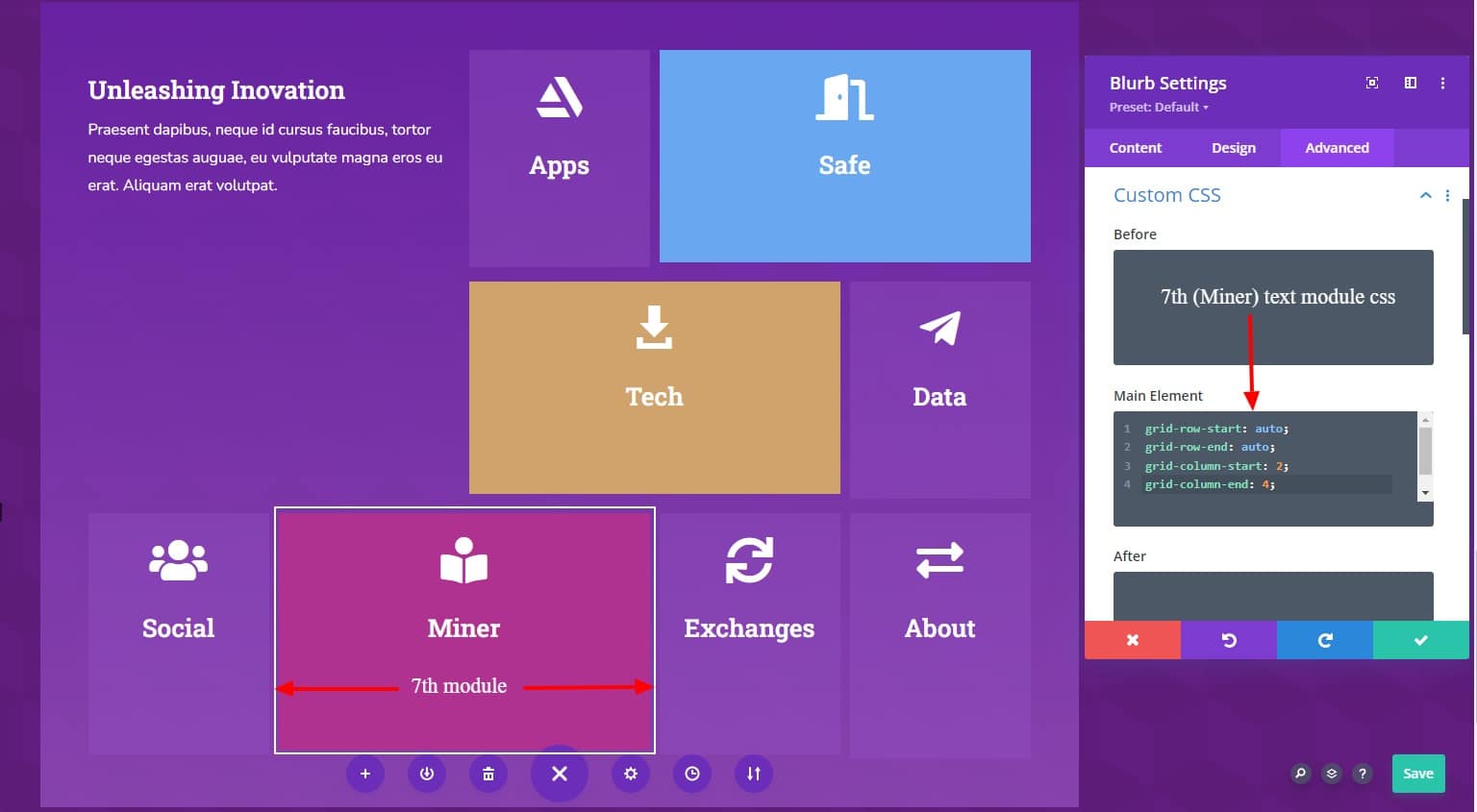
Custom CSS for the 7th module ( Miner ):
- grid-row-start: auto;
- grid-row-end: auto;
- grid-column-start: 2;
- grid-column-end: 4;
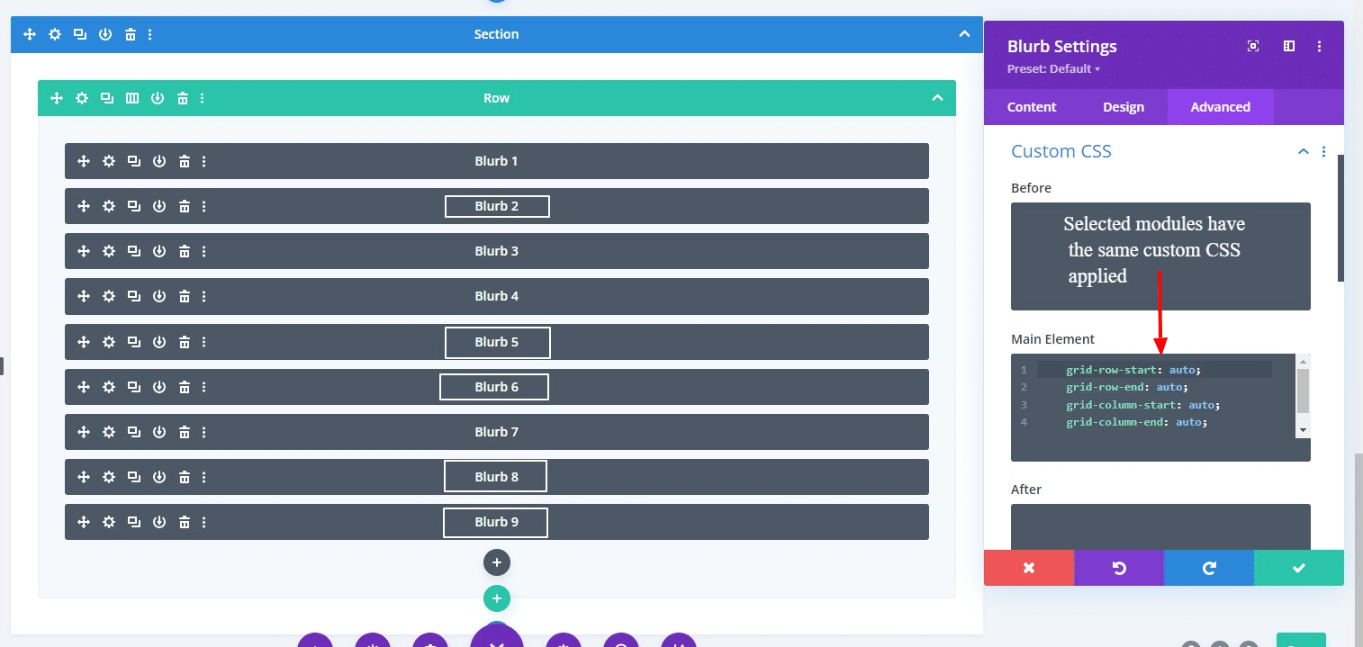
The rest of the modules(5th,6th, 8th, and 9th) use the same CSS
- grid-row-start: auto;
- grid-row-end: auto;
- grid-column-start: auto;
- grid-column-end: auto;
Final Result
Here is the final result of our custom grid CSS grid layout.

In this tutorial, we showed how to create a CSS grid layout by the Divi modules. But it is a little bit complicated because of writing custom CSS code.
If you want to create a CSS grid layout very easily without writing a single piece of custom CSS code, then you can use our very own Divigrid module.
DiviGrid, your ultimate toolkit for designing captivating websites with ease and precision. DiviGrid offers a comprehensive grid system that includes over 30 premium modules and an impressive library of 550+ design demos, empowering you to create stunning, responsive layouts effortlessly. This robust package features 10 versatile layout pages, 50 meticulously crafted header layouts, and over 50 dynamic sections, providing endless possibilities for customization. DiviGrid is not only feature-rich but also budget-friendly, making high-quality web design accessible to everyone. Additionally, it comes with a premium child theme, ensuring your website stands out with a professional and polished look. Transform your web design projects with the power and flexibility of DiviGrid.
If you want to read more about CSS grid layout from Elegant Themes website please visit Elegant Themes CSS Grid
Please let me know what you think about this and if you want to read more please visit Tips & Tricks


This is awesome.
Thank you.
Excellent article.
Glad to hear that you liked our article. Hope this will help you to create a nice grid layouts for your website or client website.