

Show your blog posts in a magazine-style grid, a split list or photo cards. Five steps in the Divi Builder, each with a screenshot, and no custom code.
To create a blog post grid in Divi, add the DG Post Grid module to a page, choose the post type and which posts to show, set the columns per device or pick a grid pattern, then choose what each card shows and add pagination. New posts appear in the grid automatically. The module is part of the DiviGrid plugin and works in Divi 5 and Divi 4.
What is a Divi post grid?
A post grid is a section that lists your posts as cards. Each card can show the featured image, the title, an excerpt and details such as the date or category. The grid is built from your posts, so you do not edit the page when you publish something new.
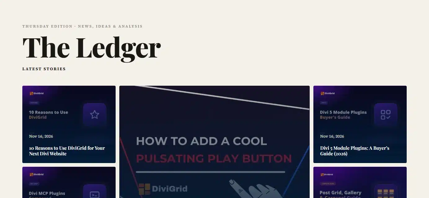
You can see this layout and five others on the Post Grid demo page.
What you need
- The Divi theme or the Divi Builder plugin (Divi 5 or Divi 4). The screenshots below are from Divi 5.
- The DiviGrid plugin, which includes the DG Post Grid module.
- A few published posts, each with a featured image.
How to create a blog post grid in Divi
Add the DG Post Grid module
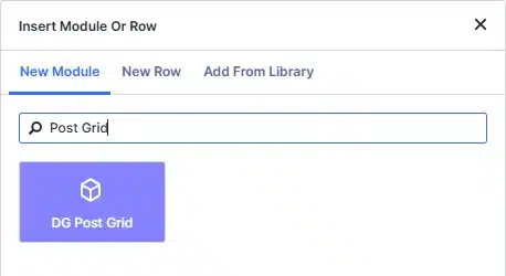
Open a page, a post or a Theme Builder template in the Divi Builder. Add a row, click the grey plus icon, type Post Grid and click DG Post Grid.
Choose which posts to show
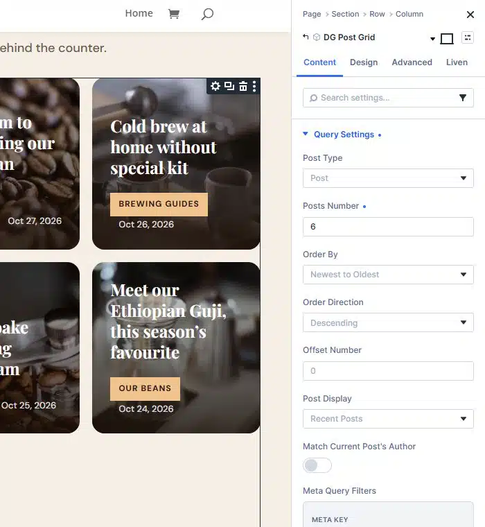
Open Query Settings. This is where the grid gets its posts, so new posts appear on their own once it is set:
- Post Type: Post for a blog, or Product, a project type or any custom post type.
- Posts Number: how many cards to show, for example 6.
- Order By and Order Direction: newest first is the usual choice.
- Offset Number: skips the first posts. Use it when another module already shows your latest post.
- Post Display: Recent Posts, or posts from chosen categories or tags.
- Meta Query Filters and Date Filter: advanced filters by custom field or date.
Pick a grid pattern
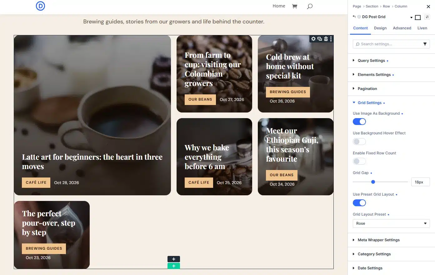
Open Grid Settings. For equal cards, leave Use Preset Grid Layout off and set the columns. For a magazine look, turn it on and choose a Grid Layout Preset. The builder lists 32 named patterns, from Rose and Lily to Pineapple and Grape.
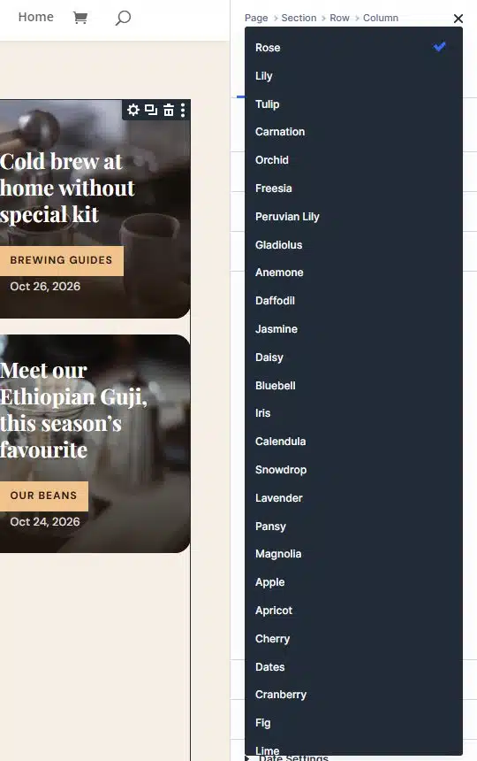
The same six posts look very different with two presets. Rose puts one big story first:
Orchid gives two posts the most space:
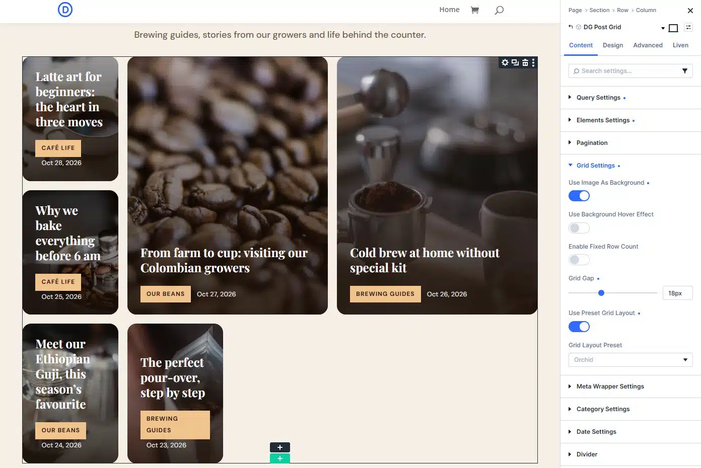
Also in Grid Settings: Use Image As Background fills each card with the featured image, Use Background Hover Effect animates it, and Grid Gap sets the space between cards.
Choose what each card shows
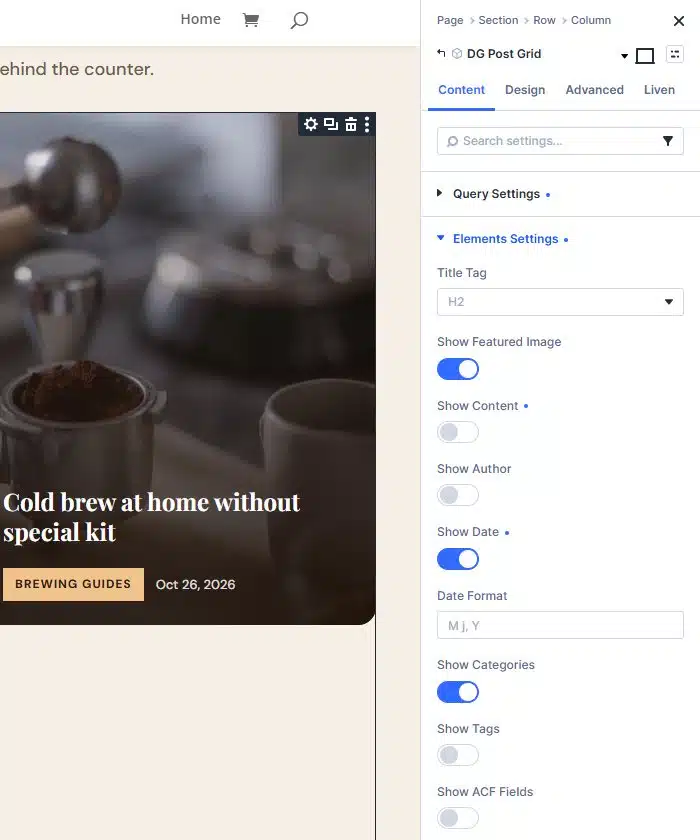
Open Elements Settings and switch parts of the card on or off: Show Featured Image, Show Content (the excerpt), Show Author, Show Date with its Date Format, Show Categories, Show Tags and Show ACF Fields. Title Tag sets the heading level; H2 or H3 keeps your page outline clean.
Add pagination, style and save
Open Pagination and turn on Show Pagination if you have more posts than cards. Then use the Design tab for fonts, colours, the category badge and the date, and click Save.
Choose the right layout
| Layout | What it looks like | Good for |
|---|---|---|
| Plain grid | Cards of equal size, with your own number of columns per device. | Blog archives and category pages. |
| Grid patterns | 30+ magazine-style arrangements that mix large and small cards. | A blog home page or a news front page. |
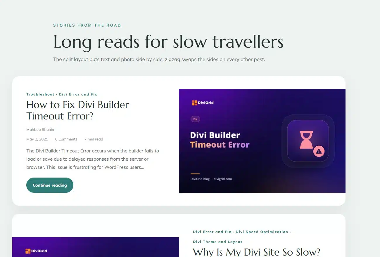
| Split and zigzag | Text and photo side by side. Zigzag swaps the sides on every other post. | Long reads and journals. |
| Photo as background | The featured image fills the card, with an overlay and a slide on hover. | Travel, food and photo-led blogs. |
Add pagination that does not reload the page
Turn on pagination and choose numbered pages or Older and Newer links. Both load the next posts with AJAX, so the visitor stays in the same place on the page instead of jumping back to the top.
Use it for more than blog posts
- WooCommerce products. Choose products as the post type. Each card can show the price and an Add to cart button.
- Custom post types. List projects, events, team members or any other type on your site.
- ACF fields. Turn on ACF fields, list the field names and place them before the title, before the content or after it.
- Theme Builder archives. Use the current loop in a Theme Builder template to design your category and archive pages.
Looking for other grid types? For card and bento layouts with your own content, see the Content Grid module. For photos, see the masonry gallery tutorial.
Tips for a better blog grid
- Use featured images of the same shape. Cards line up better when the images share one aspect ratio.
- Keep excerpts short. Two lines are enough to earn a click.
- Show fewer details. A date and a category are usually enough. Hide the rest.
- Use one column on phones. Cards stay readable and easy to tap.
See six blog layouts built with the module, from a news front page to a travel blog.
Frequently asked questions
How do I make a blog grid in Divi?
Add the DG Post Grid module, choose the posts, set the columns per device or turn on a grid pattern, then choose what each card shows, add pagination and save.
Can I show only one category or tag?
Yes. Show recent posts, posts from chosen categories or tags, or terms from a custom taxonomy.
Does it work with WooCommerce products and custom post types?
Yes. Choose the post type in the module. For WooCommerce products each card can show the price and an Add to cart button.
Does pagination reload the page?
No. Numbered pages and Older and Newer links load the next posts with AJAX, so the visitor stays in place.
Does the Post Grid module work in Divi 4?
Yes. The Post Grid module is available in both Divi 5 and Divi 4.
See the Post Grid module, read the complete guide to post grid, gallery and carousel modules or compare the plans.







0 Comments